How Fitt’s Law Improves UX Design? 6 Simple Facts!
Jan 16, 2025 3 Min Read 1836 Views
(Last Updated)
Do you know a recent study revealed that moving the add cart button to the left-hand menu of the website caused a 34% increase in sales by that site? That is how the user’s eye makes sense of the web pages. Now that is specifically relevant to web designing, explained by Fitt’s law. Understanding Fitt’s law will open another dimension in design. So, let’s see what is Fitt’s law and how Fitt’s law improves UX design.

Table of contents
- What is Fitts Law & how Fitt's law improves UX design?
- Takeaways:
- Origin of Fitt's Law
- Fitt's Law in layman's terms
- In short:
- Applications to UX: How Fitt's law improves UX design?
- Optimizing the Size of the Target:
- Optimizing Distance to Target:
- Conclusion
What is Fitts Law & how Fitt’s law improves UX design?
Fitt’s Law states that the time to acquire a target is a function of the distance to and size of the target.
Takeaways:
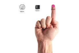
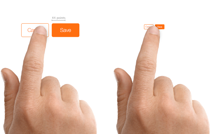
Targets should be large enough for users to accurately select them.
Targets should have ample spacing between them.
Targets should be placed in areas of an interface that allow them to be easily acquired.
Origin of Fitt’s Law
Psychologist Paul Fitts was examining the human motor system in 1954 when he found out that the time required to move to a target directly depends on the distance to it while relating inversely to its size.
Fitt’s law states that quick movements and tiny targets result in huge error rates. It happens due to the speed-accuracy trade-off.
How Fitt’s law improves UX design?
As we proceed to the next phase, make sure you understand the fundamentals of UI/UX, which includes heuristic analysis, journey maps, testing, & much more along with Fitt’s law. If you want to explore more about it, join GUVI’s UI/UX Course with Placement Assistance. You’ll also learn about the tools used in UI/UX which are AdobeXD, Illustrator, Photoshop, Figma, and many more. Build some amazing real-time projects to get hands-on experience.
Fitt’s Law in layman’s terms
As per Fitt’s law, smaller buttons are tricky and time-consuming to click. This law hugely influences the user experience (UX) and user interface (UI) design for the right reasons.
The convention of making interactive buttons large, especially on finger-operated mobile devices, is a byproduct of this law.
Thus, Fitts’s law presents the connection between the time taken by a pointer to point to a particular target. Here the pointer can be anything used to show, say, a mouse cursor, a human finger, or a hand while, the target is anything ranging from a physical or digital button to a physical object.
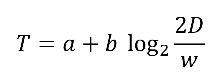
w is the width of the target
& a and b are constants that vary depending on the type of pointer.
Technically, Fitts’s law equation uses the width of the target in the direction of the movement. But, for most rectangular targets common in user interfaces, we can replace them with the smallest of the target dimensions, whether it’s height or width.
In short:
- The bigger the distance to the target, the longer it will take for the pointer to move to it.
- The larger the target, the shorter the movement time to it.
Applications to UX: How Fitt’s law improves UX design?
Fitts’s law can be grouped into 2 distinct categories,
- Size of the target &
- Distance to the target
1. Optimizing the Size of the Target:
#1. Bigger targets are better:
One of the most prominent implications of Fitts’s law is to make targets big.
Fitts’s law demonstrates that people are faster to click, tap, or hover on bigger targets. Also, error rates go down as target sizes increases.
#2. Icon plus labels give better performance:

It goes without saying that icons plus labels are more prone to be clicked: Because
1. bigger size
2. self-explanatory image
#3. Avoid crowding targets:
If you place targets too close to each other, there is a risk that people will accidentally overshoot and accidentally trigger the wrong target.
Note that this is especially likely to happen if the targets are small.
#4. Remember that Padding is not enough:
A padded target is usually a small target that has a bigger invisible active area around it. If people don’t realize that a target is padded, they will still slow down as they approach it in order to make sure they hit the visible area.
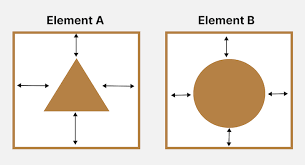
#5. Infinite Targets Along Screen Edges:
The edges of the screen are “infinitely deep”; you can’t miss the edge as the mouse stops when it gets there. Also, this infinite depth is doubly true for corners, so those are the easiest to select areas, not under the mouse.
2. Optimizing Distance to Target:
1. Menu Design:
Do you know that the different types of menus make a difference in movement time? Yes! A linear menu, a rectangular menu (ribbon menu) or a pie menu produce a different effect on the click factor.
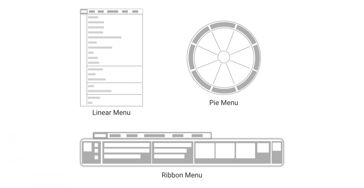
The average distance from the menu handle to a menu element depends on the type of menu: linear menus are less efficient than rectangular menus, which, in turn, are less efficient than pie menus.
2. Place Related Targets Close to Each Other
If you know that a set of controls will be clicked in a certain order, place them close to each other (but not too close — see guideline above) to minimize the distance between them and optimize overall task time.
For better UI/UX Designing: Why do we need to apply -SOLID- software design principles?
Conclusion
Using Fitt’s Law you can control different aspects of human cognition. It will help in interaction design. This way you will find yourself much better equipped to put yourself in your users’ shoes. Use Fitt’s Law and be a better Designer!
Looking forward to improving your UI/ UX Designing skills? Kickstart your UI/UX journey by enrolling in GUVI’s UI/UX Course where you will master technologies like AdobeXd, Illustrator, and Figma, and build interesting real-life UI/UX projects.
More topics like how Fitt’s law improves UX design
How to Start Competitive Programming in 5 steps?
How to use Robot Class in Selenium using Java? Step-by-step guided tutorial!













Did you enjoy this article?