Wireframe vs. Mockup vs. Prototype: Top Differences
Jan 16, 2025 3 Min Read 3526 Views
(Last Updated)
Terms like wireframe, mockup, and prototype are prevalent when you work with UI/UX designing. But do you understand what they mean? As a UI/UX designer, you must be well aware of these terms and should know when to use what. Also, are the three interchangeable?
Each one of them is used to illustrate concepts, gather feedback, and gain consensus so that teams can design and build exactly what customers want. Although they seem to be similar, they serve distinct roles during the product development lifecycle.
In this blog, we’ll read about the key differences between wireframe vs. mockup vs. prototype. Not just the definition, you’ll also understand it better with the help of its characteristics and examples. So, let’s move ahead in this journey.
Table of contents
- Wireframe vs. Mockup vs. Prototype: Top Differences
- Wireframes
- Mockups
- Prototype
- Understanding the Key Differences Between Wireframe vs. Mockup vs. Prototype
- Conclusion
- Also Read:
- FAQs
- Q1. What is the difference between a wireframe and a prototype in Figma?
- Q2. What are wireframe mockups and prototypes?
- Q3. Which comes first wireframe or mockup?
- Q4. What are mockups used for?
Wireframe vs. Mockup vs. Prototype: Top Differences
This is a key takeaway for Wireframe vs. Mockup vs. Prototype:
- Wireframes: Focus on structure, minimalistic, low-fidelity, and non-interactive.
- Mockups: Visual aesthetics added, high-fidelity, static, non-interactive.
- Prototypes: Interactive, simulates user experience, dynamic.
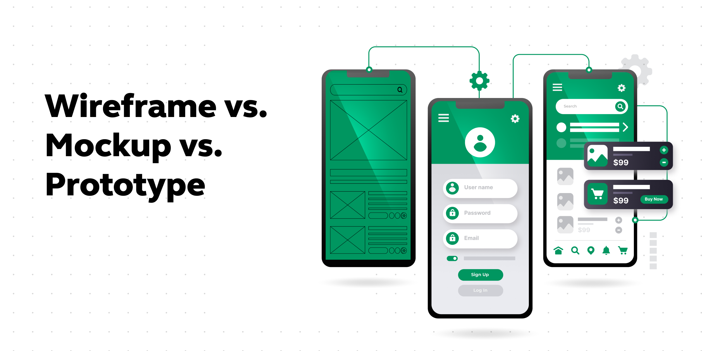
It’s crucial to recognize that each stage (wireframe vs. mockup vs. prototype) serves a specific purpose in the design process, contributing to the gradual evolution of an idea into a fully functional product.
Let us read in detail about wireframes, mockups, and prototypes in detail to understand them better with the help of their characteristics, and examples.
Before starting find out 10 Important UI/UX Testing Tools For UI/UX Designers
As we proceed to the next phase, make sure you understand the fundamentals of UI/UX, which includes heuristic analysis, journey maps, testing, etc. If you want to explore more about it, join GUVI’s UI/UX Course with Placement Assistance. You’ll also learn about the tools used in UI/UX which are AdobeXD, Illustrator, Photoshop, Figma, and many more. Build some amazing real-time projects to get hands-on experience.
Also, if you want to explore Figma through a Self-paced course, try GUVI’s Figma certification course.
Wireframes
Wireframes serve as the foundational architecture of a digital product. It is like a skeletal structure that outlines the placement of elements on a page without delving into visual aesthetics. Wireframes are typically low-fidelity representations, focusing on the arrangement of components such as buttons, forms, and navigation menus. Their primary purpose is to establish the structural hierarchy and flow of information within an interface.
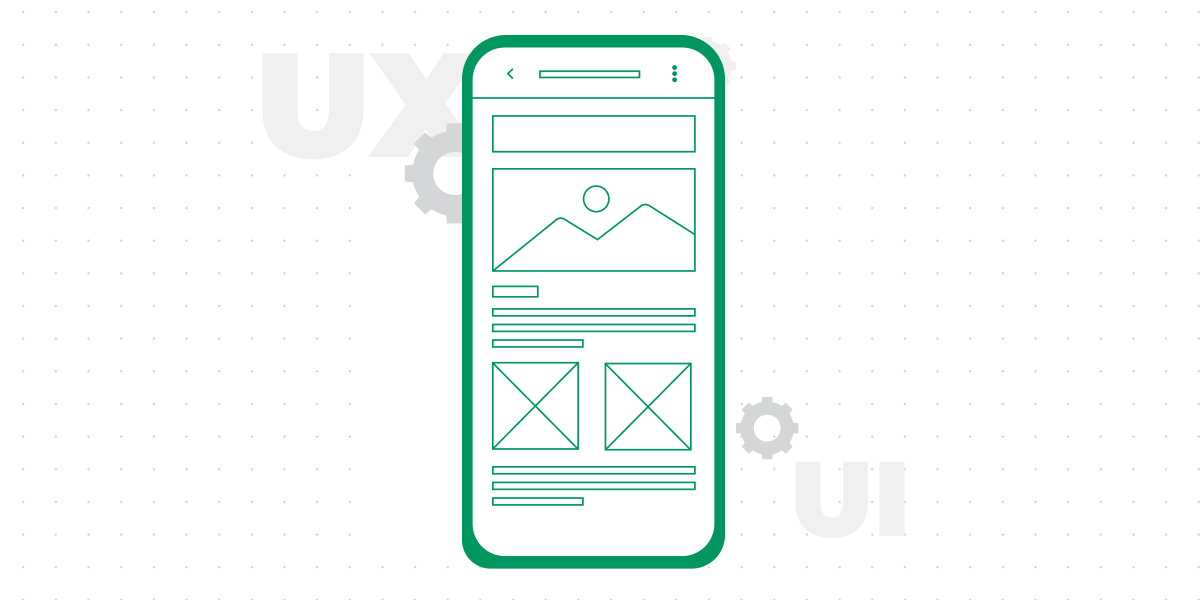
Key Characteristics of Wireframe:
- Minimalistic representation
- Focus on layout and structure
- Low-fidelity visuals
- No color or styling details
Example: A wireframe for a website might showcase the header, navigation bar, and content area, emphasizing the placement and interaction of these elements.
Mockups
Moving up the design hierarchy, we encounter mockups, which elevate the wireframe by introducing visual elements and design aesthetics. Mockups are high-fidelity static representations that provide a more realistic preview of the final product. They include colors, typography, and imagery, offering stakeholders a tangible impression of the design’s look and feel without functional interactivity.
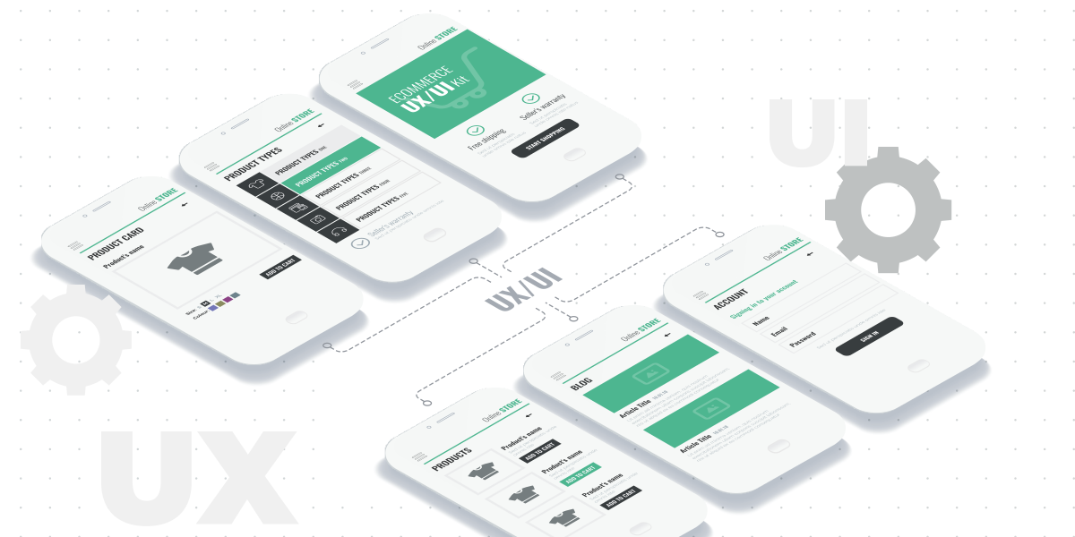
Key Characteristics of Mockups:
- Visual aesthetics incorporated
- High-fidelity representation
- Inclusion of colors, typography, and imagery
- Static, non-interactive
Example: A mockup for a mobile app might showcase the application screens with detailed visual elements, such as button styles, color schemes, and iconography.
Prototype
Prototypes are the dynamic entities in the design hierarchy, simulating the interactive experience of the final product. Unlike wireframes and mockups, prototypes go beyond static representations, allowing users to interact with the design elements. Prototypes serve as a proof of concept, enabling stakeholders to test usability, navigation, and functionality before the development phase.
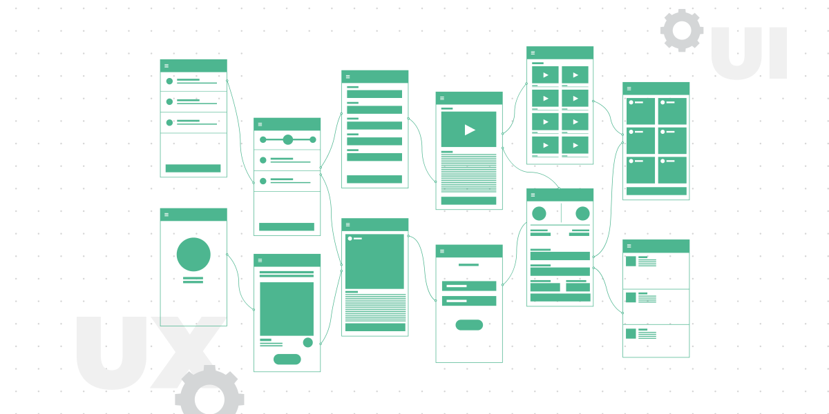
Key Characteristics of Prototype:
- Interactive functionality
- Simulates user experience
- Demonstrates navigation and flow
- May include basic transitions and animations
Example: A prototype for a web application could allow users to click through different sections, submit forms, and experience basic transitions, providing a hands-on feel of the product’s functionality.
Also Read 8 Best UI/UX Prototyping Tools
Understanding the Key Differences Between Wireframe vs. Mockup vs. Prototype
Let’s have a look at some of the key pointers between wireframe vs. mockup vs. prototype:
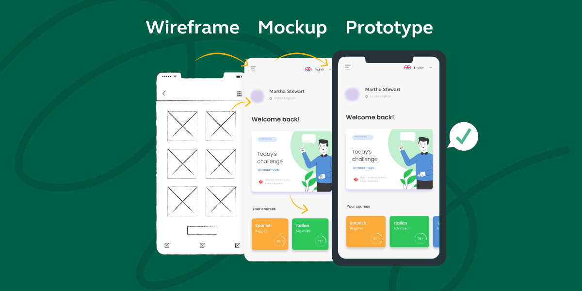
| Wireframe | Mockup | Prototype |
|---|---|---|
| Basic visual layout that outlines the structure and elements of a page or screen. | Visual representation of a design with the look and feel of the final product. | Interactive simulation of the final product, demonstrating user interactions and functionality. |
| Low-fidelity representation, focusing on structure and layout without detailed design elements. | High level of detail, including colors, images, and styling. | Medium to high level of detail, showcasing functionality and interactions. |
| Defines the structure and layout of a page or screen. | Communicates the visual aesthetics and design elements. | Tests and validates the functionality, user interactions, and flow. |
| Created before mockups to outline the basic structure. | Typically created after wireframes to visualize the final look. | Developed wireframes and mockups to test functionality and user experience. |
| Created using simpler tools like Balsamiq or wireframing features in graphic design tools. | Designed using graphic design tools like Adobe XD, Sketch, or Figma. | Built using prototyping tools like InVision, Axure, or Proto.io. |
| Feedback on layout, structure, and content placement. | Feedback on visual design, aesthetics, and branding. | Feedback on functionality, user interactions, and overall user experience. |
| Represents the skeletal structure of the product. | Represents the final visual appearance of the product. | Represents an interactive and functional version of the product. |
Kickstart your UI/UX journey by enrolling in GUVI’s UI/UX Course where you will master technologies like AdobeXd, Illustrator, and Figma, and build interesting real-life UI/UX projects.
Alternatively, if you would like to explore Figma through a Self-paced course, try GUVI’s Figma certification course.
Conclusion
Now that you know the major differences between wireframe vs. mockup vs. prototype, you can use them effectively in your project. Wireframes lay the foundation, mockups breathe life into visual aesthetics, and prototypes bring interactivity to the forefront. By grasping the technical aspects of these design stages, teams can streamline their development processes, resulting in more efficient and user-centric digital products.
Also Read:
FAQs
Q1. What is the difference between a wireframe and a prototype in Figma?
Ans. The main difference between a wireframe and a prototype is that a wireframe is low-fidelity and takes less time to create, while a prototype is high-fidelity and is more time-consuming.
Q2. What are wireframe mockups and prototypes?
Ans. Wireframes communicate structure from a low-fidelity point of view, mockups highlight a product’s design from a high-fidelity point of view, and prototypes focus on a product’s functionality along with the design.
Q3. Which comes first wireframe or mockup?
Ans. The product design process starts with a simple sketch on a blank piece of paper. Then, a wireframe is created to organize your app’s content and features. The next step is to add colors, icons, pictures, and logos to the wireframe to create the mockup.
Q4. What are mockups used for?
Ans. It is created to bring life to an idea or wireframe and allows a designer to test how various visual elements work together. Mockups give stakeholders in the page the ability to see what that page will look like while making suggestions for changes in layout, color, images, styles, and more.





Did you enjoy this article?