Typography in User Interfaces: Basic Guide for Beginners
Jan 16, 2025 4 Min Read 4095 Views
(Last Updated)
To create a visually appealing website, UI/UX designers use Typography. It helps users to navigate, interact, and convey a product in such a way it has to be perceived. Do you want to know more about it? Like an in-depth understanding. Worry Not!
This blog covers all that you need to know about Typography. Starting with the definition, we’ll move towards the basic key elements used in Typography. Also, the importance of typography in UI/UX design, followed by the best practices UI/UX designers follow while using it.
Table of contents
- Typography in User Interfaces
- What is Typography?
- Key Elements of Typography in User Interfaces
- Importance of Typography in UI/UX Design
- Best Practices in Typography for UI:
- Conclusion
- FAQs
- Q1. What is the meaning of typography?
- Q2. What are examples of typography?
- Q3. Why is typography used?
- Q4. What is typography in material UI?
Typography in User Interfaces
You must start with the basic definition of typography and then move towards its key elements. Let’s begin:
What is Typography?
In the last two decades, the World Wide Web has helped designers with a vast collection of new and appealing fonts. When we talk about typography, it is one of the most crucial elements as it connects the overall design with the product’s message.
Typography in UI design is the art of organizing, and using typeface(s) in the webpage ensuring the page is readable, understandable, and scalable. The chosen typeface must have a visual impact on the user, thereby improving the interface conversion rate.
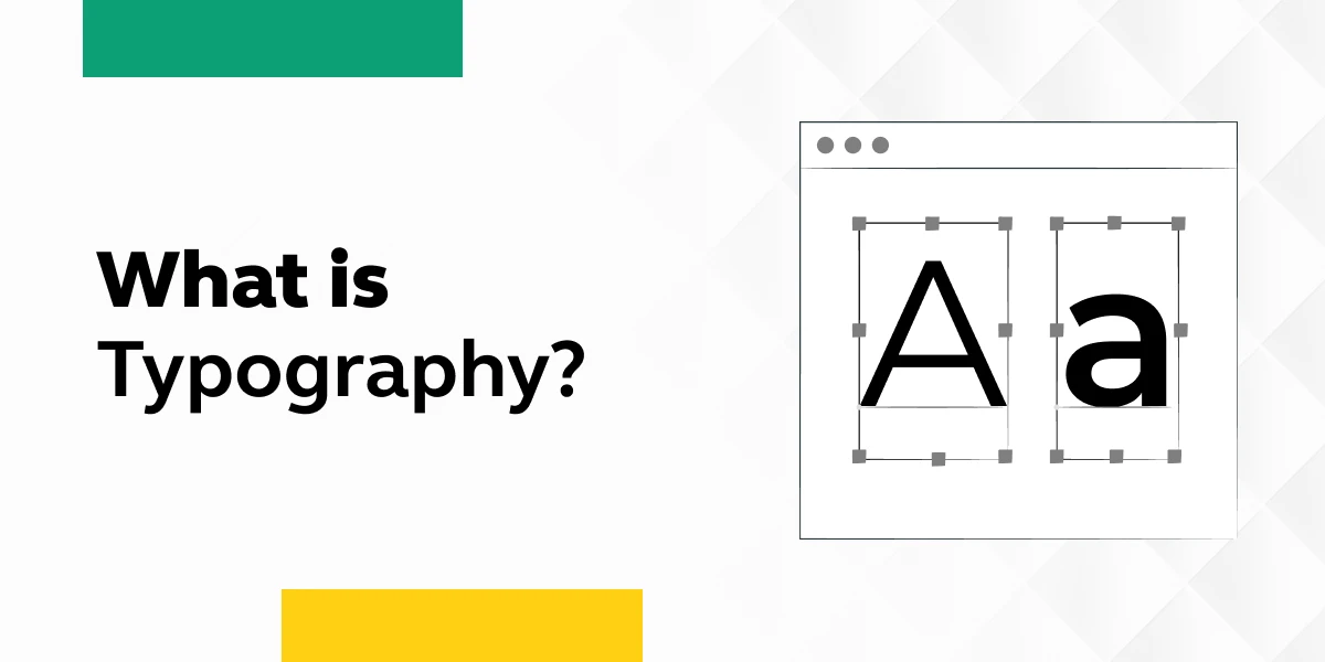
The font style, size, and structure should be chosen in such a way that it conveys the message appropriately. The first example of typography emerged from Gutenberg’s Bible, which inspired and influenced Western civilizations.
If you’re reading about Typography, you must know the top UI/UX design principles.
As we proceed to the next phase, make sure you understand the fundamentals of UI/UX, which includes heuristic analysis, journey maps, testing, etc. If you want to explore more about it, join GUVI’s UI/UX Course with Placement Assistance. You’ll also learn about the tools used in UI/UX which are AdobeXD, Illustrator, Photoshop, Figma, and many more. Build some amazing real-time projects to get hands-on experience.
Also, if you want to explore Figma through a Self-paced course, try GUVI’s Figma certification course.
Key Elements of Typography in User Interfaces
Next, you must know the key elements of typography in User Interfaces. Some of them are typefaces and fonts, white spaces, tracking, kerning, consistency, hierarchy, etc. Let’s read about them one by one:
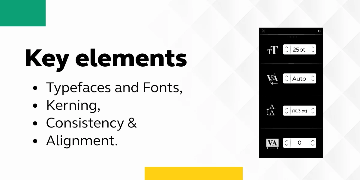
- Typefaces and fonts: The basic elements of typography include font and typeface. The key difference between font and typeface is a font is a graphical representation of text characters. In contrast, a typeface is a design style that consists of multiple characters, which vary in weight and size.
- White space: White space is the empty space surrounding the text, images, or other graphics in interfaces. It is used to enhance the text’s overall readability, flow, and feel.
- Tracking: Also known as letter spacing, tracking is adjusting the space for a group of type characters that form a word and text block. It helps users to easily read the letters in a word.
- Kerning: It is another method of arranging typography in UI/UX design. It is similar to tracking, where tracking is the space between all the font characters, whereas kerning is the space between just two type characters.
- Consistency: It means establishing a hierarchy that directs the use of fonts, their sizes, and formatting. It helps the readers easily navigate the text by subconsciously noticing and embracing the hierarchy and help them read the text.
- Hierarchy: Another important element is the hierarchy which helps organize the text on their digital products by determining the use of typefaces and their styles, sizes, and weight.
- Alignment: It means setting equal space, size, and distance between the elements – text or graphics.
- Color: Choosing the right color that fits your digital product background and other graphics is a very crucial element in typography. A proper balance of color in the text, its nuances, hues, and saturations, with other elements to achieve a clean look and seamless experience.
- Contrast: It is used to create a distinction using different colors, sizes, fonts, or even another typeface. Good use of contrasts adds another level to the overall quality hierarchy of typography in UX/UI design and makes it easier for users to navigate.
If you want to dig deep into the core concepts of UI/UX, consider learning from one of the best course - UI/UX Design Course which not only covers the core concepts but also gives you placement assistance.
Importance of Typography in UI/UX Design
Before using typography, you must understand its importance in UIUX design. It influences how users perceive and interact with digital products. Let’s look at the importance it holds:
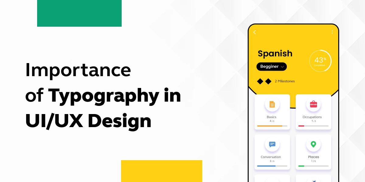
1. It helps you build brand recognition by encouraging your users to associate the typeface featured on your site with your brand.
2. It holds the attention of the readers by being impactful and memorable.
3. If you have a well-designed typography, it enhances user engagement by making a pleasing interface and easy to navigate.
4. The design when made responsive, helps in adjusting to various screen sizes and resolutions.
5. The choice of fonts and sizes is considered so as not to impact the loading time of a website.
6. A good typography decides the clarity of the page and makes it easy to scan, navigate, and make decisions.
Also, Explore 8 Effective Ways to Learn UI/UX Design [2025]
Best Practices in Typography for UI:
Now that you know the key elements, let’s read about some of the best practices in Typography for UI which helps designers deliver an efficient outcome:
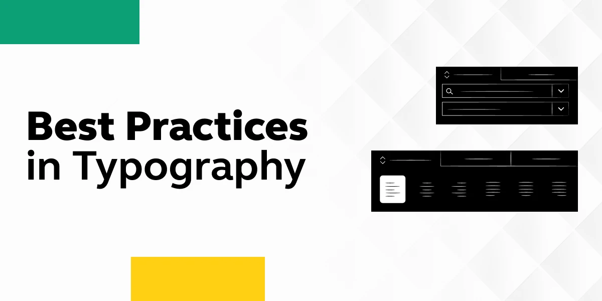
- Choose fonts that are easy to read, especially in small sizes.
- Limit the number of fonts used to maintain a cohesive and harmonious design.
- Establish a clear hierarchy by varying font sizes, weights, and styles for different levels of information.
- Ensure proper alignment of text elements for a clean and organized look.
- Use appropriate margins and padding to create breathing space around text elements.
- Design for various screen sizes and resolutions by using responsive typography.
- Maintain consistency in typography across the entire UI for a unified and professional appearance.
- Be mindful of cultural considerations when selecting fonts, as certain fonts may carry different meanings in different cultures.
- Stay informed about current typography trends and best practices to keep your designs fresh and relevant.
Do try your hands-on on top project ideas in UI/UX to get a better understanding of the fundamentals.
Kickstart your UI/UX journey by enrolling in GUVI’s UI/UX Course where you will master technologies like AdobeXd, Illustrator, and Figma, and build interesting real-life UI/UX projects.
Alternatively, if you would like to explore Figma through a Self-paced course, try GUVI’s Figma certification course.
Conclusion
As a UI/UX designer, you must definitely know the use cases of typography, its key elements, and its importance. Knowing the best practices to follow will help you deliver a better product (in terms of delivering a visually appealing, seamless, and enjoyable user experience), and build the brand’s value. As a beginner, if you clearly go through all of the pointers, you can surely move into advanced topics and excel in typography.
Also Read Top UI/UX Design Trends: Embracing Innovation in 2025
FAQs
Ans. Typography in UI design is the art of organizing, and using typeface(s) in the webpage ensuring the page is readable, understandable, and scalable.
Ans. One of the examples of typography is comic sans (a sans-serif typeface was created in 1994 by Microsoft). It was specifically meant to be easy to read, which is why it is used extensively by educators, especially for children.
Ans. Typography is used to enhance legibility, and readability and improve the brand’s quality and authority.
Ans. The typography component follows the material design typographic scale that provides a limited set of type sizes that work well together for a consistent layout.


![What Does a UI/UX Designer Do? [Career Guide] 8 What does a UI/UX designer do?](https://www.guvi.in/blog/wp-content/uploads/2023/12/UX-Designer-Do_.webp)


![How To Switch Career In UI/UX Design? Easy or Hard? [2025] 11 how_to_switch_to_a_career_in_ui_ux_design_](https://www.guvi.in/blog/wp-content/uploads/2023/12/how_to_switch_to_a_career_in_ui_ux_design_.webp)


Did you enjoy this article?