
The Role of Micro-Interactions in UX
Jan 16, 2025 5 Min Read 3280 Views
(Last Updated)
Have you ever noticed how satisfying it feels to swipe down on your phone and see it refresh? Or the little animations that happen when you like a post? These are called micro-interactions, and they’re really important in making apps and websites easy and fun to use.
Micro-interactions are the tiny things we barely notice when we’re using our phones or computers, but they make a big difference in how we feel about an app or a website. They help guide us on what to do next, like when a button lights up to show us where to click, or they give us feedback to let us know that the computer understood our command.
In this blog, we’re going to talk about why these little interactions are so important. We’ll see how they make our digital experiences better and how they can even make simple tasks a little more enjoyable. So, if you’re curious about how these small details make a big impact, keep reading. We’re going to explore all the ways micro-interactions help us every day in the digital world.
Table of contents
- What Are Micro-Interactions?
- The Role of Micro-Interactions in UX Design
- Enhancing Usability
- Guiding User Behavior
- Adding Delightful Details
- Communicating System Status
- Encouraging User Engagement
- Balancing Simplicity and Complexity
- Benefits of Micro-Interactions in UX Design
- Examples of Micro-Interactions
- Scrollbar
- Pull-to-Refresh Animation
- Swipe Animation
- Digital Alarm
- Notification
- Conclusion
- FAQs
- What are micro-interactions and why are they important in UX design?
- How do micro-interactions enhance user engagement?
- Can micro-interactions impact the usability of a product?
What Are Micro-Interactions?
Micro-interactions are the small, often unnoticed actions that occur within a digital product. They’re the tiny functionalities or animations that happen when you interact with a device or application. For example, when you turn off an alarm on your phone, the switch you tap is a micro-interaction.
These interactions are usually so seamless and integrated into our digital experiences that we might not even think about them, but they play a big part in how we feel about using a product.
The elements that make up a micro-interaction are as follows:
- Trigger: This is what starts a micro interaction. It can be user-initiated, like clicking a button, or system-initiated, like a notification popping up when you receive a new message.
- Rules: These define what happens during the micro interaction. For instance, if you swipe down to refresh a page, the rule is that the page will reload and display any new content.
- Feedback: This is what the user sees, hears, or feels in response to the interaction. It could be a sound, a visual animation, or a vibration. Feedback lets users know that the system has received their input.
- Loops and Modes: These determine the length of the interaction and its changes over time. For example, a looping animation might indicate that a page is loading, or different modes might be activated in response to how a user interacts with a feature (like silent or vibrate modes on a phone).
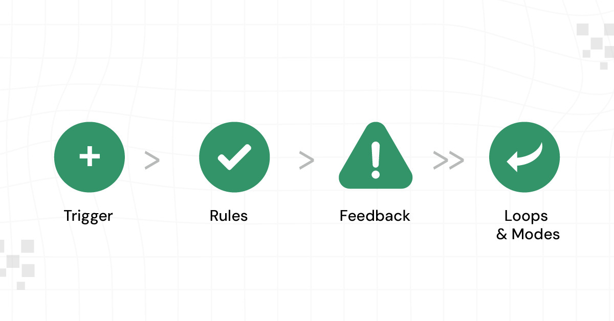
Each of these elements works together to create a complete micro-interaction. Good micro-interactions are intuitive; they feel natural and make the user experience smoother and more enjoyable. They might be small, but they have a big impact on how we perceive and use digital products.
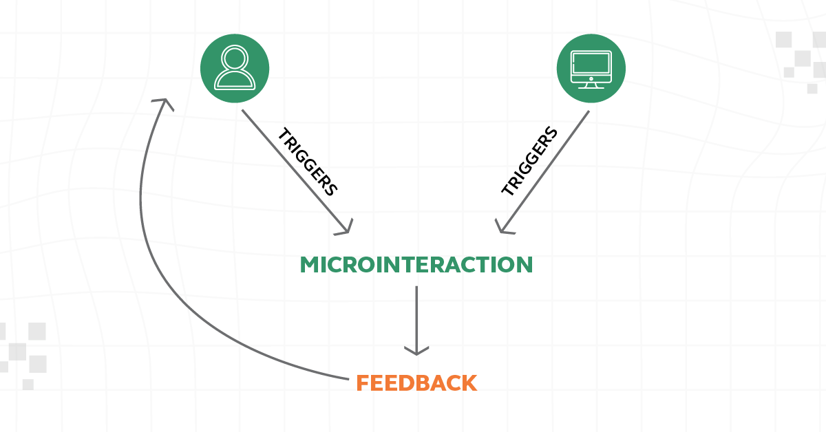
After understanding what micro-interactions are, let’s now explore their role in UX Design and how they contribute to creating a more intuitive and engaging user experience.
As we proceed to the next phase, make sure you understand the fundamentals of UI/UX, which includes heuristic analysis, journey maps, testing, etc. If you want to explore more about it, join GUVI’s UI/UX Course with Placement Assistance. You’ll also learn about the tools used in UI/UX which are AdobeXD, Illustrator, Photoshop, Figma, and many more. Build some amazing real-time projects to get hands-on experience.
Also, if you want to explore Figma through a Self-paced course, try GUVI’s Figma certification course.
The Role of Micro-Interactions in UX Design
Let’s take a closer look at micro-interactions in UX Design and see how these tiny details make a big difference in how we use and enjoy our apps and websites:
1. Enhancing Usability
Micro-interactions play a key role in making interfaces more intuitive and user-friendly. By providing immediate feedback in response to a user’s action, they clarify the result of an interaction. For example, a color change on a button when it’s clicked helps users understand that their action has been registered. This immediate visual or tactile response makes the interface easier to navigate and reduces the learning curve for new users.
2. Guiding User Behavior
Micro-interactions are also instrumental in subtly guiding user behavior. They can draw attention to certain elements, suggesting the next step a user should take. For instance, a gentle animation on a “Sign Up” button can guide the user’s eye and suggest that this is their next course of action. This subtle guidance helps users navigate through a digital product without feeling overwhelmed or lost.
Know More About User Flow in UX Design: 11 Important Steps to Look After
3. Adding Delightful Details
These small interactions can significantly enhance the user experience by adding delightful details. A playful animation when a task is completed or a unique sound effect can make the interaction more enjoyable. These delightful moments create a memorable experience, encouraging users to continue engaging with the product.
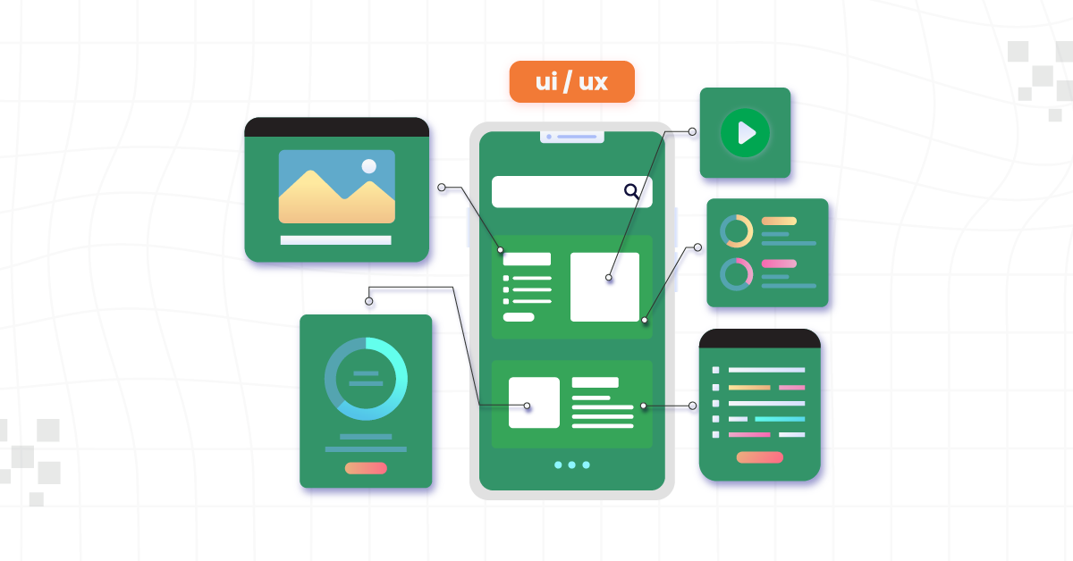
4. Communicating System Status
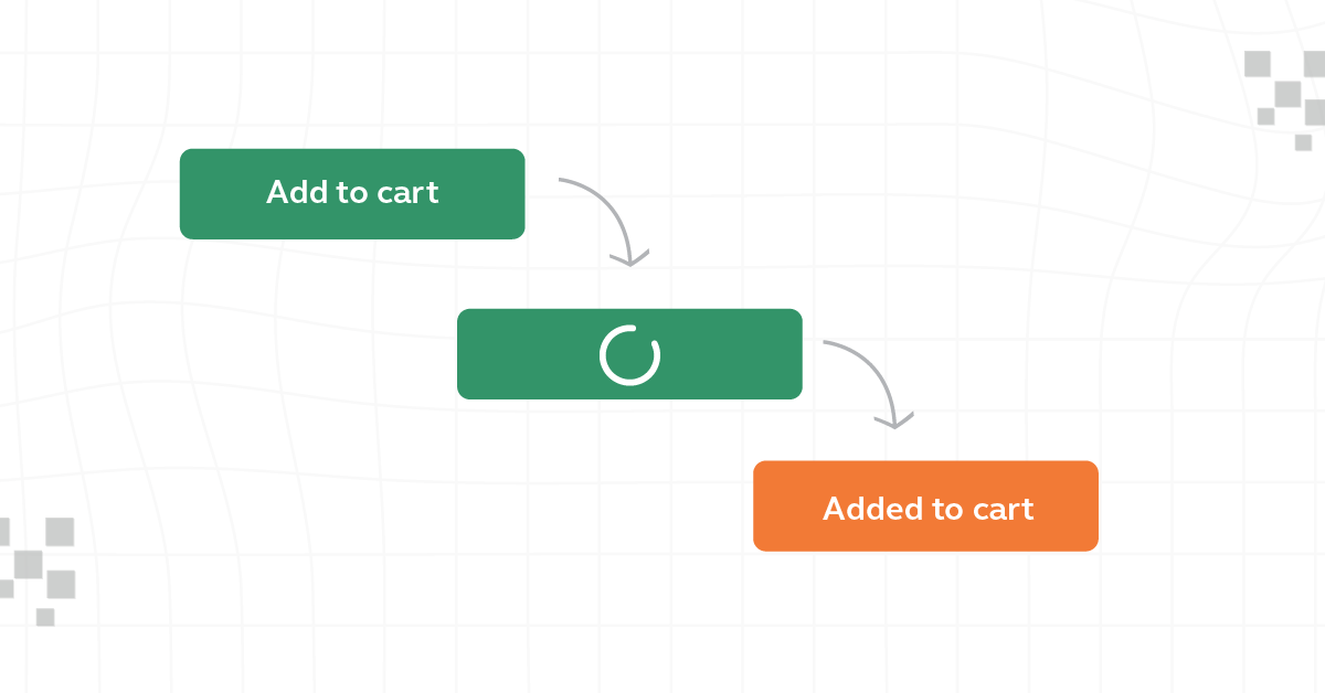
Micro-interactions are important in informing users about the system’s status. For example, a spinning icon or a progress bar during a file upload keeps the user informed about the ongoing process, reducing uncertainty and frustration. It assures users that the system is working as expected and provides an estimated wait time.
5. Encouraging User Engagement
Engaging in micro-interactions can significantly boost user interaction and retention. When users find the interactions enjoyable or helpful, they are more likely to continue using the application. For example, a rewarding animation for completing a task can encourage users to continue using the app to discover more such interactions.
6. Balancing Simplicity and Complexity
While designing micro-interactions, it’s essential to balance simplicity and complexity. They should be simple enough to be understood and used effortlessly but complex enough to provide the necessary functionality and enjoyment. Overly complicated micro-interactions can confuse users, while overly simple ones may not be engaging or informative enough. The key is to keep them intuitive and efficient without overwhelming the user.
Also Read: UI/UX Designer Job Description and Roles & Responsibilities
Having understood the important role micro-interactions play in UX Design, let’s now shift our focus to the numerous benefits they offer in enhancing user experience and overall design effectiveness.
Benefits of Micro-Interactions in UX Design
Micro-interactions offer several advantages in UX design, each contributing to a more positive and engaging user experience. Here’s a summary of their key benefits:
1. By providing immediate and intuitive feedback, micro-interactions make digital products easier to navigate and understand. This improves the overall usability of the product, making it more accessible to a wider range of users.
2. These small interactions can captivate users, making even mundane tasks enjoyable. This heightened level of engagement leads to increased user satisfaction and loyalty.
3. Micro-interactions effectively communicate system status and guide users through their interactions. This clear communication reduces user frustration and errors, as users are better informed about the system’s workings and their actions’ outcomes.
4. They offer subtle cues guiding users on how to use a product without overt instructions. This intuitive guidance helps users feel more confident and in control of their experience.
5. Well-designed micro-interactions can evoke an emotional response, creating a sense of delight or surprise. This emotional connection can make the experience more memorable and encourage repeated use.
Micro-interactions in UX design are powerful tools for creating more efficient, enjoyable, and intuitive user experiences. Their ability to guide, inform, and delight users, while simplifying interactions, plays a crucial role in the success of a digital product.
Also Read: Top 11 UI/UX Design Tools for 2024

Having explored the numerous benefits of micro-interactions in enhancing user experience, let’s now shift our focus to some practical examples. These examples will help you understand better how micro-interactions function in everyday digital interactions, bringing the concept to life.
Examples of Micro-Interactions
Micro-interactions are the little things we do in everyday life that make things easier or more fun. They happen when we use apps or websites and help us know what’s going on. For example, when you like a photo and see a little heart pop up, that’s a microinteraction. Let’s look at some simple examples to see how they work:
1. Scrollbar
The scrollbar is a fundamental micro-interaction in user interfaces. It provides a visual and interactive way for users to understand where they are on a page and how much content is available. When a user scrolls up or down, the movement of the scrollbar offers immediate feedback on the action’s effect. This simple tool makes navigating through long pages or lists intuitive and efficient, enhancing the overall user experience.
2. Pull-to-Refresh Animation
The pull-to-refresh animation, commonly used in mobile applications, is an innovative micro-interaction. Users pull down the screen, usually at the top of a content feed, and release to initiate a refresh action. This interaction feels natural and intuitive, mimicking a physical action in the digital space. It has become a standard in mobile apps for checking new updates or content, contributing significantly to the ease of use.
3. Swipe Animation
Swipe animations are integral to navigational experiences, especially in touch-screen devices. Swiping to change pages, access menus, or dismiss items provides a tactile and interactive experience. This gesture-based navigation feels more natural and engaging than traditional clicking, allowing quicker, more fluid movement through content. The visual feedback of items moving or reacting to the swipe enhances user understanding and interaction with the interface.
4. Digital Alarm
In digital alarm applications, micro-interactions significantly enhance user experience. Setting an alarm involves interactions like scrolling through numbers, with immediate visual and often tactile feedback. Disabling an alarm might involve swiping or shaking the phone, which feels more engaging than simply pressing a button. These interactions make the application more interactive and can even help in waking up the user more effectively.
5. Notification
Notifications are a vital micro-interaction for user engagement. They alert users to new messages, updates, or other important events. The way a notification appears and is interacted with — whether it’s a banner that drops down, an icon that lights up, or a vibration pattern — can significantly affect how users perceive and respond to the information.
These examples demonstrate how micro-interactions can enhance functionality, intuitiveness, and engagement in digital products, making everyday interactions smoother and more enjoyable.
Kickstart your UI/UX journey by enrolling in GUVI’s UI/UX Course where you will master technologies like AdobeXd, Illustrator, and Figma, and build interesting real-life UI/UX projects.
Alternatively, if you would like to explore Figma through a Self-paced course, try GUVI’s Figma certification course.
Conclusion
Micro-interactions are important in making apps and websites easy and fun to use. They are the little things that we do, like swiping or clicking, which make our experience better. Designers should focus on these small parts because they can make a big difference in how much we like using an app or a website. Paying attention to these tiny details can make our online experience much better.
Also Explore 10 Real-World UI/UX Applications: The Magic of UI/UX
FAQs
Micro-interactions are small, often unnoticed features in an app or website that improve the user’s experience. They’re important because they make digital products easier to use and more enjoyable.
For example, the animation when you like a social media post is a micro-interaction.
Micro-interactions engage users by adding fun and interactive elements to a website or app. They provide feedback, like a sound or vibration, to let users know their action was successful, making the experience more interactive and satisfying.
Yes, micro-interactions can significantly improve a product’s usability. They provide guidance and feedback, making it easier for users to understand how to use an app or website. For instance, a button changing color when clicked confirms the action and guides the user on what to do next.


![How To Switch Career In UI/UX Design? Easy or Hard? [2025] 8 how_to_switch_to_a_career_in_ui_ux_design_](https://www.guvi.in/blog/wp-content/uploads/2023/12/how_to_switch_to_a_career_in_ui_ux_design_.webp)


![How to Get a UI/UX Job With No Experience? [2025] 13 Feature image - How to Get a UIUX Job With No Experience](https://www.guvi.in/blog/wp-content/uploads/2023/12/Feature-image-How-to-Get-a-UIUX-Job-With-No-Experience.webp)

Did you enjoy this article?