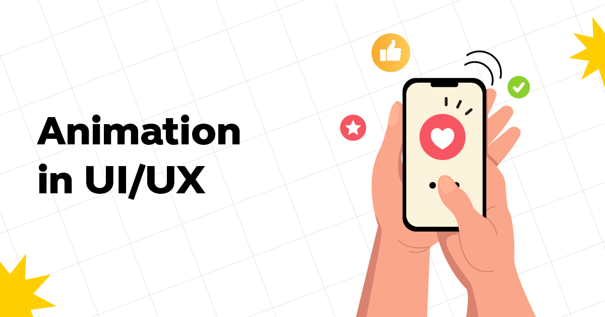
Animation in UI/UX: Captivating Designs Through Motion
Mar 05, 2025 4 Min Read 5617 Views
(Last Updated)
In the ever-evolving world of web design, motion design has become an indispensable asset for creating an engaging and user-friendly experience.
While animations on websites are often used for aesthetic purposes, there is a science behind why they work so effectively. Our peripheral vision is highly sensitive to motion, making us more receptive and easily distracted by movement.
As a result, motion design/animation in UI/UX has emerged as a powerful tool in website design to attract and retain user attention.
Table of contents
- Understanding UI/UX Animation in Web Design
- Real-life Examples of Motion Design/Animation in UI/UX and Micro Interactions in Brand Websites
- Twitter (now, X) Rewards your 'like' with an Animated Heart
- Apple adds Motion to Product Features
- Airbnb adds a Subtle Arrow on their Listings
- ASOS showcases Inventory Quantity with a Loading Bar
- Etsy uses Motion when Adding Items to the Basket
- Adidas Shakes its Sizes Up
- Capturing User Attention with Aesthetically Pleasing Animation
- Nike and Levi's add a Top Bar with the Latest Updates and Promotions
- Netflix shows a Preview of an Actual Product Feature
- Apple and kiwi.com use Text Animation
- Mailchimp adds Animation to their 404 Page
- Microsoft uses Transitions on their Products
- Quick Facts and Tips for Animation in UI/UX
- Takeaways...
- What is animation in UI UX design?
- What is the role of animation and motion in UX?
- What is a UI motion designer?
- What is animation in Figma?
Understanding UI/UX Animation in Web Design
In the past, motion on websites was primarily used for aesthetic appeal. For example, a featured animated image or a mascot animation aimed at increasing brand awareness.
However, with a deeper understanding of how users react to motion, websites have advanced to incorporate UI and UX animation that serves a larger purpose in engaging users and providing responsive feedback. UI/UX animation offers a more natural and intuitive experience for users when interacting with websites, enhancing overall usability.
Micro-interactions, an essential aspect of animation in UI/UX, acknowledge and respond to user input. These micro-interactions are triggered by button clicks, swipes, or any other user-initiated condition.
For instance, when adding an item to a cart on an e-commerce site, the empty cart icon might animate into a filled cart, visually indicating a successful action. These subtle animations guide users and offer an engaging experience, while also reducing cognitive burden by providing immediate user feedback.
Also Know UI/UX Designer Job Description: Know-It-All
As we proceed to the next phase, ensure you understand the fundamentals of UI/UX, including heuristic analysis, journey maps, testing, etc. If you want to explore more about it, join GUVI’s UI/UX Course with Placement Assistance. You’ll also learn about the tools used in UI/UX which are AdobeXD, Illustrator, Photoshop, Figma, and many more. Build some amazing real-time projects to get hands-on experience.
Also, if you want to explore Figma through a Self-paced course, try GUVI’s Figma certification course.
Real-life Examples of Motion Design/Animation in UI/UX and Micro Interactions in Brand Websites
Numerous brands have successfully incorporated motion design and micro-interactions into their websites to enhance user experience. Let’s explore a few notable examples:
1. Twitter (now, X) Rewards your ‘like’ with an Animated Heart
When users ‘like’ a tweet on Twitter, the heart icon animates into a red color, followed by a burst of confetti. This animation not only signifies a completed action but also adds a delightful moment to the social media experience. Making it one of the best examples of animation in UI/UX.
2. Apple adds Motion to Product Features
Apple’s website incorporates a subtle yet effective motion design where clickable and scrollable elements enlarge slightly upon mouse hover. This animation communicates to users that these elements are interactive and lead to additional pages or actions.
3. Airbnb adds a Subtle Arrow on their Listings
To enhance the browsing experience, Airbnb’s listings include motion design that allows users to scroll through location pictures effortlessly.
When hovering over a picture, an arrow appears on the right side, indicating that users can scroll through the images without clicking on the listing. Another great and highly creative example of animation is UI/UX.
4. ASOS showcases Inventory Quantity with a Loading Bar
ASOS, a popular online fashion and cosmetics retailer, includes a loading bar below their listing pages with subtle UI animation. The bar fills up each time users click “LOAD MORE,” visually indicating the number of remaining products to browse.
5. Etsy uses Motion when Adding Items to the Basket
Etsy, a global online marketplace, utilizes subtle animation when users add items to their cart. The animation includes a color change and a slider that appears on the right side of the screen, confirming the successful addition of the item.
This one albeit little has a great impact on the consumers of Etsy and has significantly improved their sales! Fascinating right? This is another great example of animation in UI/UX.
6. Adidas Shakes its Sizes Up
Sporting goods brand Adidas adds animation to their individual product pages. When users attempt to add a product to their bag without selecting a size, the size chart wobbles from left to right, reminding users to choose their size before proceeding.
Also Read | UI UX vs Product Design: 8 Insightful Comparisons
Capturing User Attention with Aesthetically Pleasing Animation
While micro-interactions primarily focus on user interaction and website functionality, additional animation elements can captivate users through aesthetic appeal.
Our attraction to visually pleasing elements makes animation an effective tool in keeping users engaged. Here are some examples of how animation can be used to capture attention:
1. Nike and Levi’s add a Top Bar with the Latest Updates and Promotions
To combat short attention spans, brands like Nike and Levi’s incorporate a top bar on their websites, showcasing promotions and product updates. Animation allows for easy alternation between different promotions, ensuring users are informed without any required action.
2. Netflix shows a Preview of an Actual Product Feature
Highlighting product features is crucial for convincing users to endorse a product or service. Netflix incorporates animation on its homepage to showcase its download feature, reinforcing the ability to watch shows offline.
3. Apple and kiwi.com use Text Animation
Text animation is a simple yet effective addition to website design. Apple utilizes Lottie animations for text animation, creating visually appealing effects that align with their branding. Kiwi.com, an online travel agency, employs motion to transform its tagline, adding dynamism and intrigue.
Also Read: How to Get a UI/UX Job With No Experience? [2024]
4. Mailchimp adds Animation to their 404 Page
Many brands have elevated their 404 error pages with animated versions. Mailchimp, for instance, features an adorable animation of a donkey with its head in the ground, coupled with a call-to-action button leading users back to the homepage.
5. Microsoft uses Transitions on their Products
Microsoft incorporates UI animation on their Surface Laptop 5 overview landing page. As users scroll through the page, accessory items fade in, indicating their interactive nature. Each accessory includes an icon that users can click on to learn more about the product.
By strategically implementing animation, these brands effectively capture user attention, enhance user experience, and promote brand engagement.
Explore Top UI/UX Design Trends: Embracing Innovation in 2024
Quick Facts and Tips for Animation in UI/UX
To ensure effective UI/UX animation design, attention to detail is crucial. Here are some essential tips to consider:
- Keep it short: Research suggests that interface animations should ideally range between 200ms and 500ms in duration. Smaller animation elements can work within the lower range of 200ms to 300ms, while larger elements can benefit from durations between 400ms and 500ms.
- Avoid excessive animations: While animations can be visually appealing, striking a balance and avoiding overwhelming users with excessive motion is essential. Define the goal of the webpage and ensure that animations complement the overall user interface, rather than causing distractions.
- Consider different devices: When designing UI/UX animations, it is crucial to consider how they will appear on various devices, including mobile and tablets. For mobile design, animations should typically be shorter, ranging between 200ms and 300ms. Tablet animations can be slightly longer, within the range of 400ms to 450ms.
- Familiarize yourself with the 12 principles of animation: Understanding the 12 principles of animation, based on Disney animators’ work and the laws of physics, can greatly enhance your UI/UX animation choices. These principles include using anticipation and adding more frames to action sequences for increased realism.
Read More: Top 12 Key UI/UX Design Principles
With these tips in mind, you can create engaging and user-friendly UI/UX animations that enhance the overall website experience.
Kickstart your UI/UX journey by enrolling in GUVI’s UI/UX Course where you will master technologies like AdobeXd, Illustrator, and Figma, and build interesting real-life UI/UX projects.
Alternatively, if you would like to explore Figma through a Self-paced course, try GUVI’s Figma’s certification course.
Takeaways…
In conclusion, UI/UX design in animation plays a vital role in enhancing user experience and engagement on websites. By incorporating motion design and micro-interactions, brands can guide users, provide immediate feedback, and create enjoyable browsing experiences.
By implementing the tips and examples provided, designers can create impactful UI/UX animations that elevate their websites to new levels of engagement and user satisfaction.
Remember, UI/UX animation is not just about aesthetics; it is a powerful tool for improving user experience and driving success in the digital world.
Also Know About Top 10 UI Design Patterns: Creating Intuitive and Engaging User Experiences
Animation in UI UX design refers to the use of dynamic elements to enhance user experience by creating visually engaging and interactive interfaces.
Animation and motion in UX are crucial in guiding users, providing feedback, and improving overall usability, making interfaces more intuitive and enjoyable.
A UI motion designer specializes in creating animated elements for user interfaces, focusing on enhancing the visual appeal and functionality of digital products.
Animation in Figma involves adding movement and transitions to design prototypes, allowing designers to simulate and test interactive experiences before development.


![What Does a UI/UX Designer Do? [Career Guide] 4 What does a UI/UX designer do?](https://www.guvi.in/blog/wp-content/uploads/2023/12/UX-Designer-Do_.webp)

![How To Switch Career In UI/UX Design? Easy or Hard? [2025] 7 how_to_switch_to_a_career_in_ui_ux_design_](https://www.guvi.in/blog/wp-content/uploads/2023/12/how_to_switch_to_a_career_in_ui_ux_design_.webp)

Did you enjoy this article?