30 Important CSS Interview Questions and Answers
Mar 20, 2025 6 Min Read 3230 Views
(Last Updated)
If you are someone who’s interested in giving life to HTML structure through CSS and you want to crack a job at that, you need to prepare for CSS (Cascading Style Sheets) interview questions and answers.
As you already know, CSS is essential for web development, giving life to HTML structure and creating visually engaging designs.
This guide will walk you through essential CSS interview questions and answers for beginners, intermediates, and advanced learners. Let’s dive into some common CSS interview questions and answers to help you shine in your next interview!
Table of contents
- Top 30 CSS Interview Questions and Answers
- Beginner Level Questions
- Coding Questions
- Advanced Questions
- Challenging Coding Questions
- Final Questions
- Conclusion
Top 30 CSS Interview Questions and Answers
Getting ready for a CSS interview requires a solid understanding of both fundamental concepts and advanced technical skills. These 30 questions comprise all those concepts and skills. Let us understand them one by one!
Beginner Level Questions
1. What is CSS? Why is it used in web development?
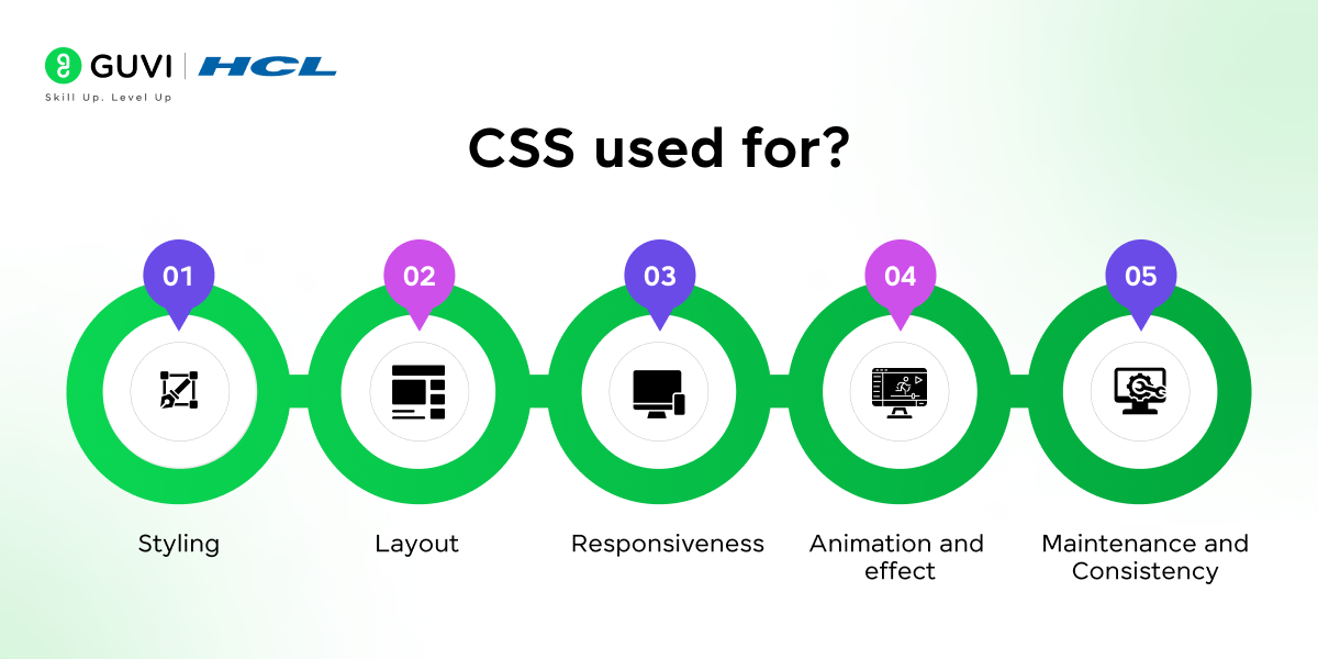
CSS stands for Cascading Style Sheets and is a language used to style HTML documents. CSS controls the layout, colors, fonts, and overall visual presentation of a website. You use CSS to make web pages visually appealing and responsive across different devices.
2. Can you explain the CSS box model?
The CSS box model is a fundamental concept that includes margins, borders, padding, and the content itself. Understanding this model is crucial since it affects how elements occupy space on a web page.
Example:
.box {

    width: 200px;

    padding: 10px;

    border: 5px solid black;

    margin: 20px;

}
3. What are the different types of CSS?
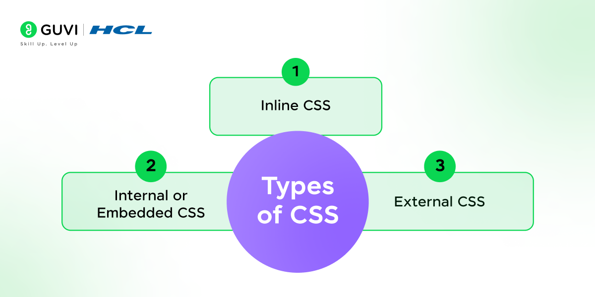
- Inline CSS: Applied directly on HTML elements using the style attribute.
- Internal CSS: Placed within the <style> tag in the head section of HTML.
- External CSS: Linked via a .css file, which is recommended for maintaining clean and reusable code.
4. Explain the difference between class and id selectors.
An id selector is unique and used for a single element, while class selectors can be applied to multiple elements. id has higher specificity, making it more powerful than class.
5. How does specificity work in CSS?
Specificity determines which CSS rule applies when multiple rules target the same element. id selectors have the highest specificity, followed by classes, attributes, and elements.
6. What is Flexbox, and how does it differ from CSS Grid?
Flexbox is used for one-dimensional layouts (either row or column). CSS Grid is more powerful for two-dimensional layouts as it can handle both rows and columns simultaneously.
7. How can you center an element horizontally and vertically using CSS?
Centering an element both horizontally and vertically can be achieved using Flexbox:
.container {

    display: flex;

    justify-content: center;

    align-items: center;

    height: 100vh; /* Full viewport height */

}
Alternatively, using CSS Grid:
.container {

    display: grid;

    place-items: center;

    height: 100vh;

}
Both methods ensure the child element is centered within the container.
8. What is the difference between padding and margin?
- Padding is the space inside an element, between the content and the border.
- Margin is the space outside the element, between the element and other elements.
9. How does the display property work?
The display property controls how an element appears on the page. Some common values are:
- block: Takes up the full width, starting on a new line.
- inline: Only takes up as much width as needed, without starting a new line.
- none: Hides the element completely.
10. What is a CSS class, and how do you use it?
A CSS class is a reusable style you can apply to multiple elements. To use it, you define it in CSS with a . before the class name (e.g., .exampleClass) and then apply it to HTML elements using the class attribute. This lets you style multiple elements in the same way.
Coding Questions
11. How would you create a centered, responsive navigation bar?
This is a practical test of Flexbox. Here’s an example:
.navbar {

    display: flex;

    justify-content: center;

    background-color: #333;

}

.navbar a {

    padding: 10px;

    color: white;

}
12. Write CSS code to make a div occupy the full screen.
Here’s how to write a CSS code to make a div occupy the full-screen
.full-screen {

    width: 100vw;

    height: 100vh;

}
13. Explain the use of position in CSS. What are the different position values?
- CSS position determines how an element is placed on the page. The values are:
- static: Default positioning.
- relative: Positioned relative to its normal position.
- absolute: Positioned relative to the nearest positioned ancestor.
- fixed: Positioned relative to the viewport.
- sticky: Toggles between relative and fixed, based on scroll position.
14. How would you create a hover effect to change an element’s color?
.hover-effect:hover {

    color: blue;

}
Advanced Questions
15. What are pseudo-elements in CSS?
Pseudo-elements like ::before and ::after allow you to style specific parts of an element without adding extra HTML.
16. How does the z-index property work in CSS?
The z-index property specifies the stack order of elements along the Z-axis. Elements with higher z-index values appear above those with lower values.
17. Can you explain CSS variables and provide an example?
CSS variables, or custom properties, allow you to reuse values throughout your CSS. They make styling flexible and maintainable.
:root {

    --main-color: #3498db;

}

.box {

    background-color: var(--main-color);

}
18. How would you implement responsive design in CSS?
Use media queries to adjust styles based on screen sizes. Example:
@media (max-width: 600px) {

    .container {

        font-size: 12px;

    }

}
19. What is the difference between display: none and visibility: hidden?
display: none removes the element from the document layout, while visibility: hidden hides it but maintains the layout space.
Challenging Coding Questions
20. Create a card with an image that overlays text on hover.
.card {

    position: relative;

    width: 300px;

}

.card img {

    width: 100%;

}

.card .overlay {

    position: absolute;

    top: 0;

    left: 0;

    width: 100%;

    height: 100%;

    background: rgba(0, 0, 0, 0.5);

    opacity: 0;

    color: white;

    display: flex;

    align-items: center;

    justify-content: center;

    transition: opacity 0.3s ease;

}

.card:hover .overlay {

    opacity: 1;

}
21. Explain how to use animations in CSS with an example.
Use @keyframes to define an animation and apply it to an element with animation properties.
@keyframes slide {

    from { transform: translateX(0); }

    to { transform: translateX(100px); }

}

.box {

    animation: slide 2s ease-in-out;

}
22. How would you implement a grid-based layout using CSS Grid?
CSS Grid provides two-dimensional layout capabilities. Example:
.grid-container {

    display: grid;

    grid-template-columns: repeat(3, 1fr);

    gap: 10px;

}
23. What are CSS preprocessors, and how do they help?
CSS preprocessors like SASS and LESS allow you to use variables, nested rules, and mixins, making CSS more powerful and easier to maintain.
Final Questions
24. How would you hide elements on mobile but display them on larger screens?
This can be achieved using media queries:
.hide-on-mobile {

    display: none;

}

@media (min-width: 768px) {

    .hide-on-mobile {

        display: block;

    }

}
25. What are CSS Modules, and how do they differ from traditional CSS?
CSS Modules are a methodology that allows you to write CSS with locally scoped class and animation names by default. This approach prevents global scope issues, such as naming conflicts and unintended style overrides, which are common in traditional CSS.
26. Explain the use of the overflow property.
The overflow property in CSS controls how content is handled when it exceeds the dimensions of its container. It has several values:
- visible: Default value; content is not clipped and may overflow the container.
- hidden: Overflowing content is clipped, and the rest is hidden.
- scroll: Adds scrollbars to the container, allowing users to scroll through the overflowing content.
- auto: Adds scrollbars only when necessary, i.e., when the content overflows.
- clip: Clips the content without adding scrollbars.
Proper use of the overflow property ensures that layouts remain intact and user experience is maintained when dealing with content that exceeds container boundaries.
27. Describe how to create a responsive image gallery.
To create a responsive image gallery, you can utilize CSS Grid Layout, which allows for flexible and adaptive designs. Here’s an example:
html

<div class="gallery">

  <div class="gallery-item"><img src="image1.jpg" alt="Image 1"></div>

  <div class="gallery-item"><img src="image2.jpg" alt="Image 2"></div>

  <!-- More images -->

</div>
css
.gallery {
display: grid;
grid-template-columns: repeat(auto-fill, minmax(200px, 1fr));
gap: 10px;
}
.gallery-item img {
width: 100%;
height: auto;
display: block;
}In this setup, the grid-template-columns property uses the repeat function with auto-fill and minmax to create a responsive grid that adjusts the number of columns based on the container’s width. The gap property adds spacing between the grid items. Each image scales to fit its grid cell, ensuring the gallery adapts seamlessly to different screen sizes.
28. How would you create a simple dropdown menu in CSS?
A simple dropdown menu can be created using CSS by leveraging the :hover pseudo-class. Here’s an example:
html

<nav class="navbar">

  <ul>

    <li class="dropdown">

      <a href="#">Menu</a>

      <ul class="dropdown-content">

        <li><a href="#">Option 1</a></li>

        <li><ba href="#">Option 2</a></li>

        <li><a href="#">Option 3</a></li>

      </ul>

    </li>

  </ul>

</nav>
css
.navbar ul {
list-style-type: none;
}
.dropdown-content {
display: none;
position: absolute;
background-color: #f9f9f9;
min-width: 160px;
box-shadow: 0px 8px 16px 0px rgba(0,0,0,0.2);
z-index: 1;
}
.dropdown-content li {
padding: 12px 16px;
}
.dropdown:hover .dropdown-content {
display: block;
}In this example, the .dropdown-content is initially hidden using display: none;. When the user hovers over the .dropdown element, the nested .dropdown-content becomes visible due to the :hover pseudo-class. This method provides a straightforward way to implement a dropdown menu using only CSS.
29. What is BEM methodology, and how does it help with naming conventions?
BEM (Block, Element, Modifier) is a naming convention methodology for writing CSS that promotes component-based development and reusability. It divides the user interface into independent blocks, their child elements, and their possible variants (modifiers). The naming convention follows this pattern:
- Block: The standalone entity that is meaningful on its own (e.g., button).
- Element: A part of the block that has no standalone meaning and is semantically tied to its block (e.g., button__icon).
- Modifier: A flag on a block or element that changes its appearance or behavior (e.g., button–primary).
By using BEM, developers can create clear and descriptive class names that reflect the structure of the UI components, leading to more maintainable and scalable codebases.
30. How does the z-index property work in CSS, and when would you use it?
The z-index property in CSS controls the vertical stacking order of elements that overlap. Elements with a higher z-index value are displayed in front of those with a lower value. It’s important to note that z-index only works on positioned elements (i.e., elements with a position value other than static).
You would use z-index when you have elements that overlap and you need to control which one appears on top. For example, in a modal dialog that appears over the rest of the page content, you would assign a higher z-index to the modal to ensure it displays above other elements.
In case you want to learn more about CSS and frontend development, consider enrolling in GUVI’s Full Stack Developer online course that teaches you everything from scratch and equips you with all the necessary knowledge!
Conclusion
In conclusion, mastering CSS is essential for any aspiring full-stack developer, as it’s the backbone of creating visually appealing, user-friendly web designs. Understanding the questions and answers we’ve covered can give you a strong foundation to confidently tackle CSS-related questions in an interview setting.
Remember, practice makes perfect—so keep experimenting with CSS to improve your skills and stay updated with the latest trends. Good luck with your CSS journey, and may your next interview be a success!













Did you enjoy this article?