Style Matters: Exploring Essential CSS Properties You Must Know
Mar 01, 2025 5 Min Read 3284 Views
(Last Updated)
In the digital world, where first impressions are important, the role of Cascading Style Sheets (CSS) cannot be overstated. CSS is the reason behind the visual appearance of websites, enabling developers and designers to create engaging, responsive, and accessible digital experiences. This blog aims to explain the essentials of CSS, offering a concise guide to the key properties that shape the look and feel of websites.
From mastering layout techniques with display: flex; to fine-tuning text appearance through font family, this blog will explain the fundamental CSS properties that every web creator should know. Understanding these properties is important for creating visually compelling and user-friendly websites. Keep reading to learn about the building blocks of web design, where style not only complements substance but elevates it.
Table of contents
- What is Cascading Style Sheets (CSS)?
- All CSS Properties You Need to Know to Build a Website
- Display: Flex
- Margin
- Padding
- Background-Color
- Color
- Opacity
- Width and Height
- Cursor: Pointer
- Font-Size
- Font-Family
- Best CSS Tips to Follow
- Keeping CSS Clean and Organized
- The Importance of Using CSS Variables for Efficient Styling
- Mobile-First Design: Starting with Styles for Smaller Screens
- Utilizing CSS Frameworks for Rapid Development
- Accessibility Considerations: Ensuring Your Website is Accessible to All Users
- Testing Your Website in Different Browsers and Devices to Ensure Compatibility
- Conclusion
- FAQs
- Why is it important to understand CSS properties for web development?
- How do CSS variables enhance styling efficiency?
- What is the significance of mobile-first design in CSS?
What is Cascading Style Sheets (CSS)?
Cascading Style Sheets (CSS) is a stylesheet language used to describe the presentation of a document written in HTML or XML (including XML dialects such as SVG, MathML, or XHTML). CSS defines how elements should be displayed on screen, on paper, in speech, or on other media. It is one of the most important technologies of the World Wide Web, alongside HTML and JavaScript.
CSS was designed to enable the separation of presentation and content, including layout, colors, and fonts. This separation can improve content accessibility, provide more flexibility and control in the specification of presentation characteristics, enable multiple web pages to share formatting by specifying the relevant CSS in a separate .css file, and reduce complexity and repetition in the structural content.
Also Read: A Complete Guide to HTML and CSS for Beginners
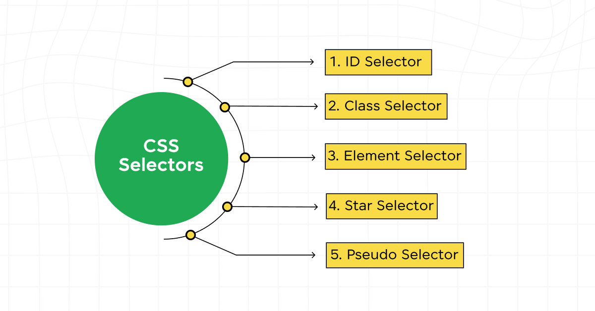
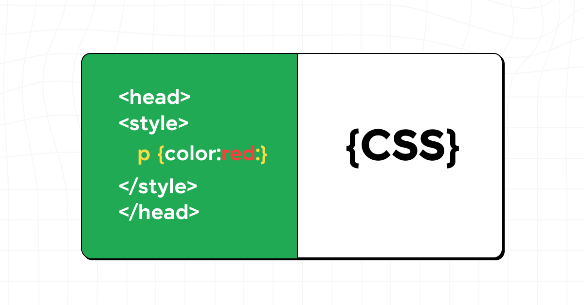
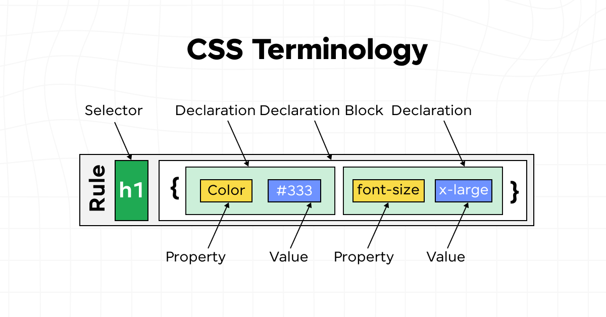
CSS styles are applied to HTML elements through selectors (which target HTML tags, classes, IDs, or attributes) and declarations (which specify the properties to be altered and their new values). These styles can be included in an HTML document internally using the <style> tag, linked externally via a separate stylesheet file referenced in the <link> tag, or applied directly to specific elements with the style attribute for inline styling.
The term “cascading” refers to the way CSS applies styles to HTML elements based on a hierarchy of importance. This hierarchy determines which styles are applied when there is more than one rule for an element. The cascade follows a simple set of priorities to resolve conflicts:
- Importance: Styles marked !important have the highest priority.
- Specificity: More specific selectors override more general ones. For example, an ID selector has a higher specificity than a class selector.
- Source Order: When two selectors have the same specificity, the last one defined in the CSS is applied.
This cascading mechanism allows for flexible styling strategies where global styles can be set as a baseline, and specific styles can override them as needed, ensuring a consistent yet customizable presentation across a website.
Also Read: Types of CSS: A Comprehensive Guide to Styling Web Pages
Before diving into the next section, ensure you’re solid on full-stack development essentials like front-end frameworks, back-end technologies, and database management. If you are looking for a detailed Full Stack Development career program, you can join GUVI’s Full Stack Development Course with placement assistance. You will be able to master the MERN stack (MongoDB, Express.js, React, Node.js) and build real-life projects.
Instead, if you would like to explore HTML and CSS through a Self-paced course, try GUVI’s Modern HTML and CSS Self-Paced certification course.
All CSS Properties You Need to Know to Build a Website
Here’s a list of the CSS properties you need to know to build a website:
Display: Flex
Flexbox, or the Flexible Box Layout, is a CSS3 layout model that allows you to design a complex layout structure in a more flexible and predictable way. It enables a container to alter its items’ width/height (and order) to best fill the available space (mostly to accommodate all kinds of display devices and screen sizes). A flex container expands items to fill available free space or shrinks them to prevent overflow.
display: flex; is particularly useful for aligning items horizontally or vertically within a container, building complex web layouts without using floats or positioning, and creating responsive designs that adjust smoothly to different screen sizes. Its impact on responsive design is significant, simplifying the creation of fluid layouts that adapt to any screen size with minimal effort.
Also Read: Top 11 CSS Frameworks for Front-End Developers: A Comprehensive Guide
Margin
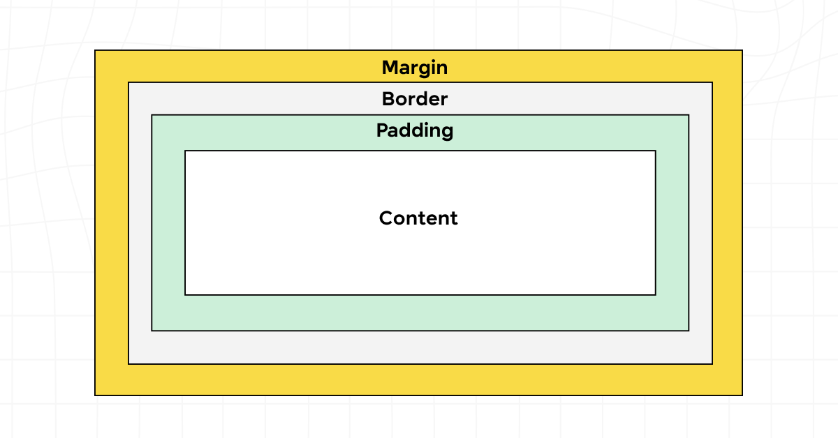
Margins are used to create space around elements, outside of any defined borders. Margins can control the spacing between elements on a page, helping to create visually appealing and well-organized layouts.
Margins can be used to separate sections of content, to push elements away from each other, or to center content within a container by setting equal margins on either side. For example, setting margin: 0 auto; on an element can center it horizontally within its parent container, contributing to a balanced and focused design.
Padding
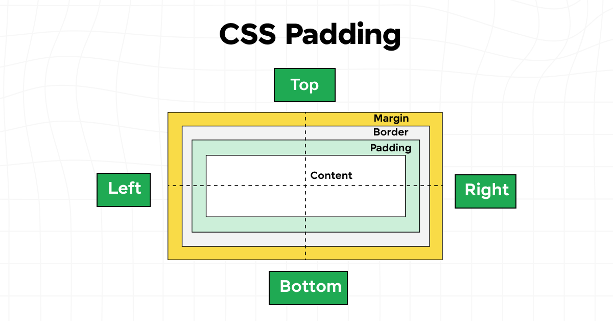
Padding is the space between an element’s content and its border, unlike margin which is the space outside the element’s border. Padding affects the internal spacing of an element, making content within an element appear larger or smaller.
Padding can be used to increase the clickable area of links for better user interaction, to create space around the content inside a box, or to separate text from the edges of a container for improved readability.
Background-Color
Background colors can be applied to elements to differentiate sections of a webpage, highlight important information, or simply improve aesthetics and readability. Choosing contrasting background colors can help elements stand out and guide the user’s eye through the layout.
Color
The color property specifies the color of the text inside an element. Using contrasting text colors can improve readability, draw attention to specific content, and contribute to the overall aesthetics of the site.
Also Read: 10 Best HTML and CSS Project Ideas for Beginners
Opacity
Opacity allows you to make elements partially transparent, creating depth in your designs and enabling overlay effects, such as modal dialogs or image overlays, without entirely blocking the content underneath.
Width and Height
Setting the width and height of elements is important for laying out your webpage. These properties can be specified in various units, including pixels, percentages, or ems, allowing for flexible and responsive design strategies.
Use relative units like percentages or viewport units (vw, vh) for width and height to create flexible layouts that adapt to the user’s screen size. This practice ensures that your design is accessible and user-friendly across devices.
Cursor: Pointer
The cursor: pointer; CSS property changes the cursor to a pointer hand icon when hovering over a link or clickable element, indicating to users that they can interact with it. This small visual cue can significantly enhance the usability and user experience of your website.
Font-Size
Font size is key to readability and the visual hierarchy of your content. Larger fonts draw attention and are used for headings, while smaller fonts are suitable for body text. Responsive units like ems or rems are recommended for text, as they allow the font size to adjust based on user settings or device screen size.
Font-Family
Font family plays an important role in conveying the tone and personality of your website. Selecting the right combination of fonts can enhance your website’s design coherence and readability. Consider web-safe fonts for maximum compatibility, or use web fonts for more variety and uniqueness in your design.
Also Read: Top 20 HTML & CSS Interview Questions With Answers
Let’s learn the best CSS tips to follow, empowering you to streamline your workflow, boost your site’s performance, and elevate the overall quality of your web designs.
Best CSS Tips to Follow
To craft a website that not only looks appealing but is also efficient and accessible, adopting best practices in CSS is important. Here are some invaluable CSS tips that can elevate your web development process:
1. Keeping CSS Clean and Organized
- Use comments: Clearly comment on your CSS code to distinguish sections and explain the purpose of specific styles.
- Organize by section: Group related styles together (e.g., layout, typography, colors) for easier navigation and maintenance.
- Follow a naming convention: Adopt a consistent naming convention like BEM (Block Element Modifier) to make classes more understandable and reusable.
Must Read: Best Techniques for Creating Seamless Animations with CSS and JavaScript
2. The Importance of Using CSS Variables for Efficient Styling
- Centralize theme styles: Use CSS variables to define common colors, fonts, and sizes. This makes it easier to maintain and update the look of your website.
- Responsive design: Utilize variables for responsive breakpoints to ensure consistency across media queries.
3. Mobile-First Design: Starting with Styles for Smaller Screens
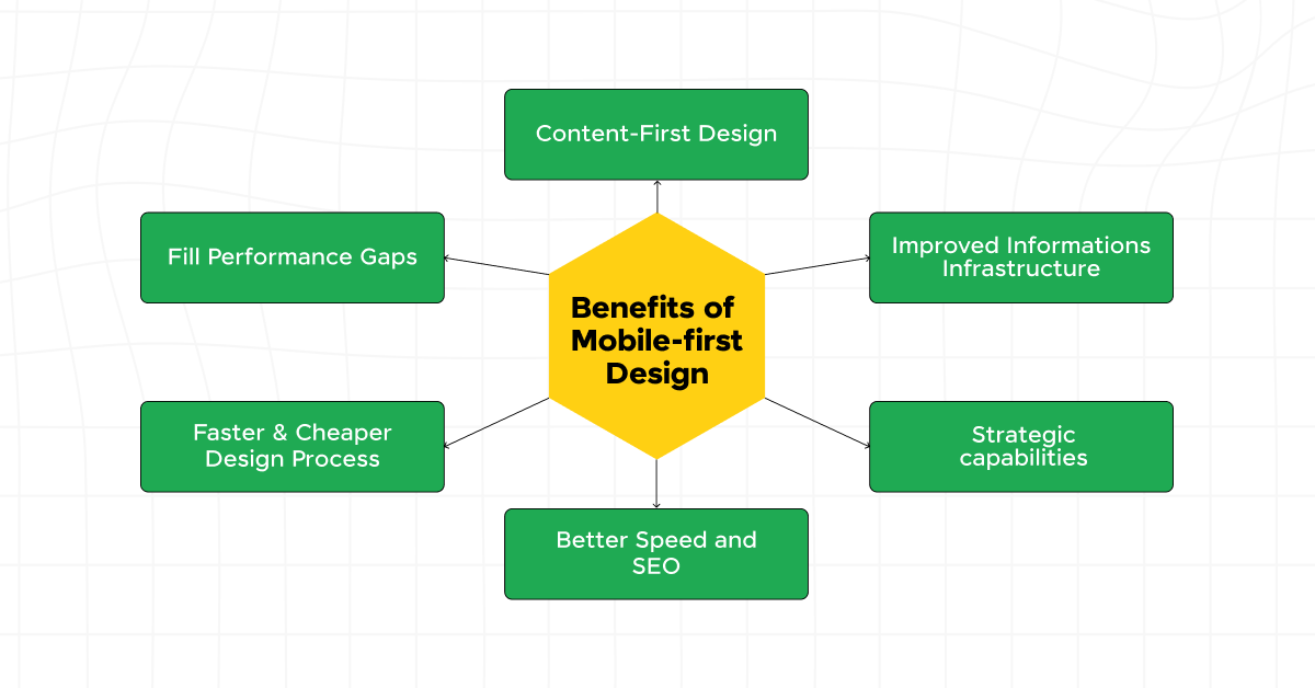
- Prioritize mobile: Design your CSS for mobile devices first, then progressively enhance your site for larger screens. This approach streamlines the development process and ensures your site is accessible on all devices.
- Efficient media queries: Use media queries to add or modify styles as the viewport grows, ensuring your site looks great at any size.
Also Read: A Comprehensive Guide to HTML and CSS Roadmap
4. Utilizing CSS Frameworks for Rapid Development
- Choose the right framework: Select a CSS framework that suits your project’s needs. Frameworks like Bootstrap, Foundation, or Tailwind CSS offer pre-designed components and utilities that can speed up development time.
- Customize wisely: While frameworks provide a quick start, customize them to fit your unique design needs to avoid a “cookie-cutter” look.
5. Accessibility Considerations: Ensuring Your Website is Accessible to All Users
- Semantic HTML: Use CSS to style semantic HTML elements correctly, which helps screen readers interpret your site’s structure.
- Color contrast: Ensure sufficient contrast between text and background colors for readability.
- Focus styles: Use CSS to style focus indicators for interactive elements, making your site more navigable with a keyboard.
6. Testing Your Website in Different Browsers and Devices to Ensure Compatibility
- Cross-browser testing: Regularly test your site in multiple browsers to identify and fix any inconsistencies.
- Responsive testing tools: Utilize tools and emulators to test your site on various devices and screen sizes, ensuring a consistent user experience.
By adhering to these CSS best practices, you can significantly improve the efficiency of your development process, the performance of your website, and the overall user experience. Remember, the key to mastering CSS lies in continuous learning and experimentation.
Kickstart your Full Stack Development journey by enrolling in GUVI’s certified Full Stack Development Course with placement assistance where you will master the MERN stack (MongoDB, Express.js, React, Node.js) and build interesting real-life projects. This program is crafted by our team of experts to help you upskill and assist you in placements.
Instead, if you would like to explore HTML and CSS through a Self-paced course, try GUVI’s Modern HTML and CSS Self-Paced certification course.
Conclusion
CSS properties are very important for successful web development, enabling you to translate creative visions into realities. Encourage yourself to experiment, learn continuously, and stay updated with the latest in CSS. Doing so not only elevates your work but also contributes to the ever-expanding universe of web design, making it more diverse, accessible, and beautiful for everyone.
Must Explore: HTML vs CSS: Critical Differences Developers Can’t Ignore
FAQs
Understanding CSS properties is important for web development because it enables developers and designers to control the layout, appearance, and overall user experience of a website.
CSS properties dictate how elements are displayed on the page, allowing for the creation of responsive, accessible, and visually appealing designs.
CSS variables, also known as custom properties, enhance styling efficiency by allowing developers to reuse values throughout their stylesheets. This is particularly useful for themes, layout metrics, and responsive design breakpoints.
By defining a variable once and referencing it in multiple places, changes can be made globally by updating a single value.
The mobile-first design approach is significant in CSS because it prioritizes the optimization of websites for mobile devices from the outset. Given the increasing prevalence of mobile internet usage, this approach ensures that websites are accessible, legible, and user-friendly on smaller screens.
Starting with mobile styles and using media queries to progressively enhance the design for larger screens can lead to more efficient code, improved performance, and a better user experience across all devices.




![A Comprehensive Guide to HTML and CSS Roadmap [Updated] 11 Feature image - A Comprehensive Guide to HTML and CSS Roadmap](https://www.guvi.in/blog/wp-content/uploads/2024/02/html_and_css_roadmap.webp)



Did you enjoy this article?