

Full Stack Development Articles
What is Web Development? A Beginner's Guide
Event Delegation and Bubbling in JavaScript

Get In Touch For Details! Request More Information

Optimizing Web Development using jQuery for Responsive Design
Sep 19, 2024 8 Min Read 2024 Views
(Last Updated)
In today’s fast-paced digital world, creating websites that offer a seamless user experience across various devices is no longer optional—it’s essential. Responsive design ensures that your website adapts beautifully to any screen size, providing an optimal viewing experience whether accessed on a desktop, tablet, or smartphone.
Enter jQuery, a powerful and widely-used JavaScript library that simplifies making websites interactive and responsive. By using jQuery, web developers can enhance the functionality of their websites with minimal effort, making it an invaluable tool in the modern web development toolkit.
In this blog, we will explore the synergy between jQuery and responsive design, exploring how jQuery can create dynamic, adaptable, and user-friendly web pages. Let’s begin!
Table of contents
- What is Responsive Design?
- What is jQuery?
- jQuery and Responsive Design
- How jQuery Enhances Responsive Design
- Key jQuery Methods for Responsive Design
- Integrating jQuery with CSS Media Queries
- Performance Considerations
- Tools and Plugins
- Conclusion
- FAQs
- How does jQuery help in creating responsive designs?
- Can jQuery be used with CSS media queries?
- What are some common jQuery plugins that aid in responsive design?
What is Responsive Design?
Responsive design, also known as responsive web design (RWD), is an approach to web design that aims to create websites and web applications that provide an optimal viewing and interaction experience across a wide range of devices and screen sizes, from desktop computer monitors to tablets and mobile phones.
The core idea behind responsive design is to make the website layout and content adapt and respond to the size and capabilities of the device being used to view it. This is achieved through a combination of flexible grids, flexible images and media, and the use of CSS3 media queries.
Here are some key principles and techniques used in responsive design:
- Flexible Grids: Instead of using fixed-width layouts, responsive design uses fluid grids that resize and reflow their content based on the screen size. This is typically achieved using CSS and grid systems like Bootstrap or Foundation.
- Flexible Images and Media: Images, videos, and other media elements are coded to be flexible and resize proportionally to the container or viewport they are displayed in.
- Media Queries: CSS3 media queries allow the website to detect the device’s screen size, resolution, and other characteristics, and apply different styles and layouts accordingly.
- Mobile-First Design: Many responsive design approaches follow a “mobile-first” philosophy, where the default styles are designed for mobile devices, and additional styles are progressively added for larger screens.
- Responsive Typography: Fonts and text sizes are coded to scale smoothly across different devices and screen sizes, ensuring readability and accessibility.
- Responsive Navigation: Navigation menus and user interface elements are designed to adapt and transform for optimal use on different screen sizes, often using techniques like responsive menus or hamburger menus.
Also Read: Responsive Design vs Adaptive Design: Which is Suitable For Your Project?
The goal of responsive design is to provide a consistent and optimized user experience across all devices, eliminating the need for separate mobile and desktop versions of a website. It also helps with search engine optimization (SEO) by providing a single, responsive codebase that can be easily crawled and indexed by search engines.

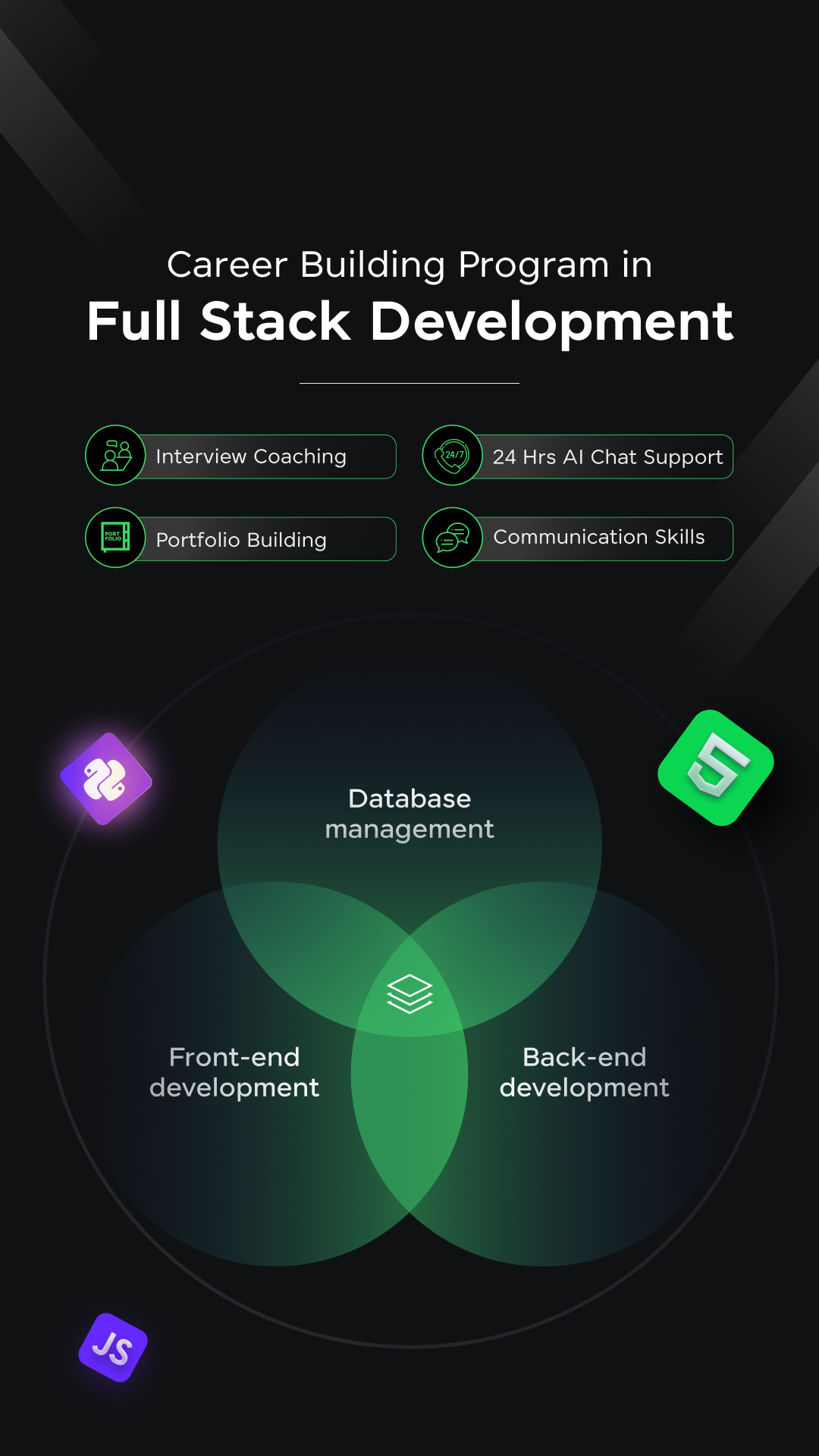
Before diving into the next section, ensure you’re solid on full-stack development essentials like front-end frameworks, back-end technologies, and database management. If you want a detailed Full Stack Development career program, you can join GUVI’s Full Stack Development Course with Placement Assistance. You will be able to master the MERN stack (MongoDB, Express.js, React, Node.js) and build real-life projects.
Additionally, if you want to explore JavaScript through a self-paced course, try GUVI’s JavaScript certification course.

What is jQuery?
jQuery is a fast, small, and feature-rich JavaScript library. It makes things like HTML document traversal and manipulation, event handling, animation, and Ajax much simpler with an easy-to-use API that works across a multitude of browsers.
jQuery was released in 2006 and has become one of the most popular JavaScript libraries, widely used by developers for building dynamic and interactive web applications.
Here are some key features and capabilities of jQuery:
- DOM Manipulation: jQuery simplifies client-side scripting of HTML by providing a concise syntax for traversing and modifying the Document Object Model (DOM) tree, selecting DOM elements, and manipulating their content, attributes, and styles.
- Event Handling: jQuery offers an elegant and consistent way to handle various browser events such as clicks, mouseovers, key presses, and form submissions.
- AJAX: jQuery provides a simple API for making asynchronous HTTP requests (AJAX) and handling the responses, enabling developers to load data from the server without refreshing the page.
- Animations and Effects: jQuery includes built-in functions for creating simple animations and effects, like fading, sliding, and custom animations.
- Cross-browser Compatibility: jQuery abstracts away many cross-browser inconsistencies and provides a consistent interface that works across different browsers and versions.
- Plugins and Utilities: jQuery has a rich ecosystem of plugins and utility libraries developed by the community, which extend its functionality in areas like form validation, data visualization, and user interface components.
- Compact Size: Despite its powerful feature set, the jQuery library itself is relatively small in file size, making it efficient to load and use.
Do check Scalable Vector Graphics (SVG) for Responsive UI Design
While modern JavaScript has advanced significantly with new features and APIs introduced in recent years, jQuery is still widely used, particularly in older codebases or projects where it provides a consistent and familiar way to work with the DOM and handle cross-browser compatibility.
However, for new projects, developers often consider using modern JavaScript frameworks like React, Angular, or Vue.js, which provide more robust and comprehensive solutions for building complex web applications, or using native browser APIs directly, which have improved significantly in recent years.
jQuery and Responsive Design
Let’s explore how jQuery can empower responsive design, discuss key jQuery methods and techniques, and cover performance considerations, tools, and plugins.
1. How jQuery Enhances Responsive Design
jQuery and responsive design are a powerful combination that can take your web projects to the next level. Here are some ways in which jQuery enhances responsive design:
a. Easier DOM Manipulation
One of the core strengths of jQuery is its ability to simplify DOM manipulation. With jQuery’s concise syntax, you can easily traverse and modify the DOM tree, select elements based on various criteria, and manipulate their content, attributes, and styles.
This becomes particularly useful in responsive design scenarios where you need to dynamically update the layout, show or hide elements, or modify styles based on the device’s screen size or orientation.
b. Responsive Navigation
Navigation menus are a critical component of any website or application, and they need to adapt seamlessly across different devices. jQuery makes it easy to create responsive navigation menus by toggling menu visibility, transforming navigation elements into dropdown or hamburger menus, and handling touch events on mobile devices.

c. Responsive Media
Responsive design often involves working with media elements like images, videos, and audio. jQuery provides convenient methods for resizing and adapting these media elements based on the viewport size, ensuring they maintain their aspect ratio and display correctly on different devices.
d. Event Handling and User Interactions
jQuery’s event-handling capabilities make it simple to respond to user interactions like clicks, swipes, scrolling, and touch events. This is particularly useful in creating responsive user interfaces that provide a seamless experience across different devices and input methods.
e. Animations and Effects
jQuery’s built-in animation and effects functions can be leveraged to create smooth transitions and animations that enhance the user experience in responsive designs. These animations can be triggered based on screen size changes, user interactions, or other events, making your website or application feel more polished and engaging.
Also Read: Mastering jQuery Debugging: Essential Things That You Shouldn’t Ignore
2. Key jQuery Methods for Responsive Design
jQuery offers a wide range of methods and functions that can be used to implement responsive design techniques. Here are some of the most commonly used jQuery methods in the context of responsive design:
a. Media Queries and Window Resize Events
CSS media queries are a fundamental part of responsive design, allowing you to apply different styles based on the device’s characteristics, such as screen size and orientation. jQuery provides methods like $(window).width() and $(window).height() to retrieve the current viewport dimensions, which can be used in conjunction with media queries to execute specific JavaScript code based on the viewport size.
Additionally, you can use the $(window).resize() event to detect when the viewport size changes and trigger appropriate actions, such as updating the layout, resizing elements, or toggling visibility.
$(window).resize(function() {

  if ($(window).width() < 768) {

    // Responsive design code for smaller screens

  } else {

    // Responsive design code for larger screens

  }

});
b. Responsive Navigation Menus
jQuery can be used to create responsive navigation menus that adapt to different screen sizes. One common approach is to use a hamburger menu for smaller screens and a traditional navigation menu for larger screens. This can be achieved using jQuery methods like addClass(), removeClass(), toggle(), and click() events.
$(document).ready(function() {

  $('.menu-toggle').click(function() {

    $('nav').toggleClass('show-menu');

  });

});
c. Responsive Images and Media
jQuery provides several methods for working with images and media elements, such as img, video, and audio. You can use methods like width(), height(), css(), and attr() to dynamically resize and adjust these elements based on the viewport size or other conditions.
$(window).resize(function() {

  $('.responsive-image').css('max-width', $(window).width() * 0.8 + 'px');

});
d. Responsive Typography
Typography plays a crucial role in ensuring readability and accessibility across different devices. jQuery can be used to adjust font sizes, line heights, and other typographic properties based on the viewport size or user preferences.
$(window).resize(function() {

  if ($(window).width() < 480) {

    $('body').css('font-size', '14px');

  } else {

    $('body').css('font-size', '16px');

  }

});
e. Responsive Content
In some cases, you may need to show or hide specific content based on the device’s screen size. jQuery’s show(), hide(), and toggle() methods, combined with conditional statements based on viewport dimensions, can be used to achieve this.
$(window).resize(function() {

  if ($(window).width() < 768) {

    $('.sidebar').hide();

    $('.main-content').css('width', '100%');

  } else {

    $('.sidebar').show();

    $('.main-content').css('width', '70%');

  }

});
Also Explore: Migrating from jQuery to Vanilla JavaScript for Modern Web Development
3. Integrating jQuery with CSS Media Queries
While jQuery provides powerful methods for implementing responsive design techniques, it’s often used in conjunction with CSS media queries to create a seamless and cohesive responsive experience. CSS media queries define the styles and layout for different screen sizes and devices, while jQuery can be used to enhance and extend the functionality of those styles.
Here’s an example of how you can integrate jQuery with CSS media queries:
css
/* CSS Media Queries */

@media (max-width: 767px) {

  /* Styles for smaller screens */

  .navigation {

    display: none;

  }

  .mobile-menu {

    display: block;

  }

}

@media (min-width: 768px) {

  /* Styles for larger screens */

  .navigation {

    display: block;

  }

  .mobile-menu {

    display: none;

  }

}
JavaScript
// jQuery Code

$(document).ready(function() {

  // Toggle mobile menu on click

  $('.mobile-menu-toggle').click(function() {

    $('.mobile-menu').toggle();

  });

  // Adjust layout based on window resize

  $(window).resize(function() {

    if ($(window).width() < 768) {

      // Responsive design code for smaller screens

      $('.sidebar').hide();

      $('.main-content').css('width', '100%');

    } else {

      // Responsive design code for larger screens

      $('.sidebar').show();

      $('.main-content').css('width', '70%');

    }

  });

});
In this example, CSS media queries define the styles for different screen sizes, such as hiding the navigation menu and showing a mobile menu toggle for smaller screens. jQuery is then used to toggle the visibility of the mobile menu when the toggle button is clicked and adjust the layout of the sidebar and main content based on the window resize event.
By combining CSS media queries and jQuery, you can leverage the strengths of both technologies to create a comprehensive responsive design solution that provides an optimal user experience across all devices.
Also Read: jQuery Selectors: An Informative Guide On The Most Essential Framework
4. Performance Considerations
While jQuery is a powerful tool for enhancing responsive design, it’s important to be mindful of performance considerations, especially when working with mobile devices or slower network connections. Here are some best practices to ensure your responsive jQuery code runs efficiently:
a. Minimize jQuery Usage
While jQuery simplifies many tasks, it’s important to use it judiciously and avoid unnecessary processing or DOM manipulation. Consider using native JavaScript methods or APIs when possible, especially for simpler tasks or when working with modern browsers that have improved support for native JavaScript features.
b. Optimize Event Handling
Event handling can be a performance bottleneck, especially when dealing with frequently triggered events like scroll or resize. Use techniques like debouncing or throttling to limit the number of times an event handler is executed, and consider unbinding event handlers when they are no longer needed.
c. Use CSS Transitions
While jQuery provides animation and effects functions, it’s often more performant to use CSS transitions and animations for simpler visual effects. CSS transitions and animations are hardware-accelerated, resulting in smoother and more efficient rendering, especially on mobile devices.
Know More About CSS Transitions: Important Things To Know About
d. Optimize Images and Media
Large image and media files can significantly impact page load times, especially on mobile devices with limited bandwidth or processing power. Ensure that you optimize images and media by compressing them, using appropriate file formats, and leveraging responsive image techniques like srcset and size attributes.
e. Lazy Loading
Lazy loading is a technique where content or resources are loaded only when they are needed, instead of loading everything upfront. This can improve initial load times and reduce the amount of data transferred, especially on slower connections. jQuery provides plugins and methods that can be used to implement lazy loading for images, videos, and other content.

f. Minify and Combine Files
Minifying and combining JavaScript and CSS files can reduce the number of HTTP requests and the overall file size, resulting in faster load times. While jQuery is already a relatively small library, minifying and combining it with your custom scripts can further optimize performance.

g. Use Caching
Caching is a powerful technique that can significantly improve the performance of your website or application by storing frequently accessed data or resources locally, reducing the need for repeated server requests. jQuery provides methods for working with browser caching, and you can also leverage server-side caching techniques to further improve performance.

5. Tools and Plugins
The jQuery ecosystem is vast, and many third-party tools and plugins have been developed to enhance and extend its functionality, including specialized solutions for responsive design. Here are some popular tools and plugins that can be useful for responsive jQuery development:
a. Responsive jQuery Plugins
- Responsive Nav: A responsive navigation plugin that transforms navigation menus into mobile-friendly, touch-enabled menus.
- FitVids.js: A lightweight jQuery plugin that automatically makes videos responsive by adjusting their aspect ratio based on the container’s dimensions.
- Responsive Slider: A responsive slider plugin that provides a touch-enabled, swipeable slider for displaying images, content, or other elements.
- Responsive Lightbox: A responsive lightbox plugin that displays images, videos, or other content in a modal overlay, optimized for various screen sizes.
b. Responsive CSS Frameworks
While not directly related to jQuery, responsive CSS frameworks like Bootstrap, Foundation, and Bulma provide a solid foundation for building responsive layouts and user interfaces. These frameworks often include jQuery plugins or compatible components that can be easily integrated into your responsive jQuery development workflow.
Explore More: Top 11 CSS Frameworks for Front-End Developers: A Comprehensive Guide
c. Task Runners and Bundlers
Tools like Grunt, Gulp, and Webpack can be used to automate tasks such as minifying and combining files, optimizing images, and managing dependencies. These tools can streamline your development process and help improve the performance of your responsive jQuery applications.
d. Browser Developer Tools
Modern web browsers come equipped with powerful developer tools that can be invaluable for responsive design and debugging. Tools like Chrome DevTools and Firefox Developer Tools allow you to emulate different device viewports, inspect and modify the DOM and styles, and debug JavaScript code, including jQuery.
e. Testing and Automation Tools
As responsive design involves catering to multiple screen sizes and devices, it’s crucial to thoroughly test your website or application across different environments. Tools like BrowserStack, Sauce Labs, and browser-based testing frameworks can help automate testing and ensure your responsive jQuery code functions correctly on various devices and browsers.
Kickstart your Full Stack Development journey by enrolling in GUVI’s certified Full Stack Development Course with Placement Assistance where you will master the MERN stack (MongoDB, Express.js, React, Node.js) and build interesting real-life projects. This program is crafted by our team of experts to help you upskill and assist you in placements. Alternatively, if you want to explore JavaScript through a self-paced course, try GUVI’s JavaScript course.
Conclusion
jQuery and responsive design are a powerful combination that can elevate the user experience of your web projects. jQuery’s strengths in DOM manipulation, event handling, animations, and AJAX requests make it an excellent companion for implementing responsive design techniques.
By using jQuery’s methods and integrating them with CSS media queries, you can create websites and applications that adapt seamlessly to different screen sizes and devices.
However, it’s important to be mindful of performance considerations, especially when targeting mobile devices or slower network connections. Implementing best practices like minimizing jQuery usage, optimizing event handling, leveraging CSS transitions, and optimizing images and media can help ensure a smooth and responsive experience for your users.
Additionally, taking advantage of the vast ecosystem of jQuery plugins, responsive CSS frameworks, and development tools can streamline your workflow and enhance the capabilities of your responsive jQuery projects.
As the web continues to evolve and new technologies emerge, the principles of responsive design remain important for delivering an optimal user experience across a wide range of devices. By combining jQuery’s versatility with responsive design best practices, you can create future-proof, accessible, and engaging web experiences that delight your users, regardless of the device they’re using.
Also Explore: DOM Event Flow: A Comprehensive Guide
FAQs
How does jQuery help in creating responsive designs?
jQuery simplifies the process of creating responsive designs by providing easy-to-use methods for manipulating the DOM, handling events, and altering CSS properties dynamically.
With jQuery, developers can effortlessly adjust layouts, toggle classes, and modify styles based on the user’s screen size or orientation. This allows for a seamless and adaptive user experience across different devices.
Can jQuery be used with CSS media queries?
Yes, jQuery can be effectively combined with CSS media queries to enhance responsive design. While CSS media queries handle the basic layout adjustments based on screen size, jQuery can be used to add interactive elements, animations, and dynamic content changes.
What are some common jQuery plugins that aid in responsive design?
There are several jQuery plugins designed to assist with responsive design. Some popular ones include Slick Slider, which is a fully responsive carousel plugin that allows for the creation of adaptable sliders and carousels;
Isotope, a layout library for creating responsive, filterable, and sortable grid layouts; and jQuery UI, a collection of GUI widgets, animated visual effects, and themes built on top of jQuery, which can be customized for responsive interfaces.
Career transition


? A Complete Guide 8")


Did you enjoy this article?