8 Stunning UI/UX Design Examples To Get You Inspired
Mar 07, 2025 5 Min Read 12727 Views
(Last Updated)
Whenever you start doing something new that you haven’t done previously, you need references to get a hang of it. Similarly, suppose you are an aspiring UI/UX designer or someone who just started UI/UX designing, you need some great UI/UX design examples for your reference.
This can help you understand why that UI/UX design stands out among others and for that, we picked out some of the best UI/UX design examples from famous brands and dissected them so that you will understand the stand-out features of them.
So, now that you know what you are up for, let us get started without further ado. But first, you need to understand what is meant by UI and UX design as it is always better to start from the basics.
Table of contents
- 8 Best UI/UX Design Examples
- Spotify
- Google Maps
- Uber
- Amazon
- Netflix
- Airbnb
- Conclusion
- FAQs
- How do UI and UX work together?
- What are the key elements of UI Design?
- What are the key elements of UX Design?
- How do Trends impact UI/UX Design?
- Can UI/UX Design influence User Behavior?
8 Best UI/UX Design Examples
Now let us jump into our main topic today, the best UI/UX design examples out there:
1. Instagram

The UI/UX design of Instagram is a great example to study, especially for beginners, as it showcases how simple and user-friendly design can enhance the overall experience of an app. Here is how:
- Focus on Images and Videos: Instagram is all about visual content. The design puts photos and videos at the forefront, making them the main focus.
- Minimal Text and Colors: The app doesn’t use a lot of text or loud colors. This minimalism makes sure that the user’s attention stays on the photos and videos, not on the app’s design elements.
- Easy to Like and Comment: One stand-out feature of Instagram that made it one of the best UI/UX design examples is its the Liking and Comment feature. Just double-tap a photo to like it, or tap the speech bubble icon to leave a comment.
- Stories Feature: The Stories feature (photos and videos that disappear after 24 hours) is placed at the top of the home screen. It’s a fun way to see what your friends are up to in real-time, without cluttering your main feed.
Instagram is one of the great UI/UX design examples out there that proves how simplicity, focus on visual content, and easy navigation can create an enjoyable and intuitive experience for users.
As we proceed to the next phase, make sure you understand the fundamentals of UI/UX, which includes heuristic analysis, journey maps, testing, etc. If you want to explore more about it, join GUVI’s UI/UX Course with placement assistance. You’ll also learn about the tools used in UI/UX which are AdobeXd, Illustrator, Photoshop, Figma, and many more. Build some amazing real-time projects to get hands-on experience.
Also, if you would like to explore Figma through a Self-paced course, try GUVI’s Figma certification course.
2. Spotify
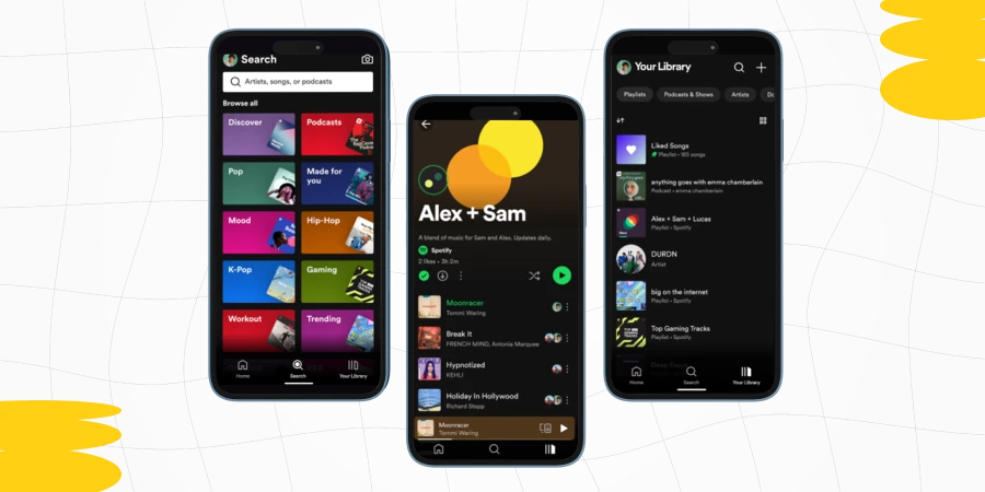
Spotify’s UI/UX design is one of the fantastic UI/UX design examples to understand how a great design can make an app not only functional but also enjoyable to use. Let us now understand the features:
- Personalized Experience: One of the key features of UI/UX design examples in Spotify is its personalized playlists, like “Discover Weekly” and “Daily Mixes.” These playlists are tailored to your music taste, providing a unique and personalized listening experience.
- Consistent Color Scheme and Branding: Spotify uses a consistent color scheme, mainly black and green, which is visually appealing and easy on the eyes, especially for an app used frequently and for long periods.
- Easy Playlist Management: Creating and managing playlists is very user-friendly. You can easily add or remove songs, rename playlists, and even share them with friends.
- Discoverability Features: The app excels in helping you discover new music. Features like “Related Artists” and genre-based radio stations make finding new music that matches your taste simple and enjoyable.
Spotify’s focus on personalization, ease of navigation, and a clean, organized layout make it a standout in the world of UI/UX design examples.
Read: The Future and Scope of UI/UX Design: A Comprehensive Overview
3. Google Maps
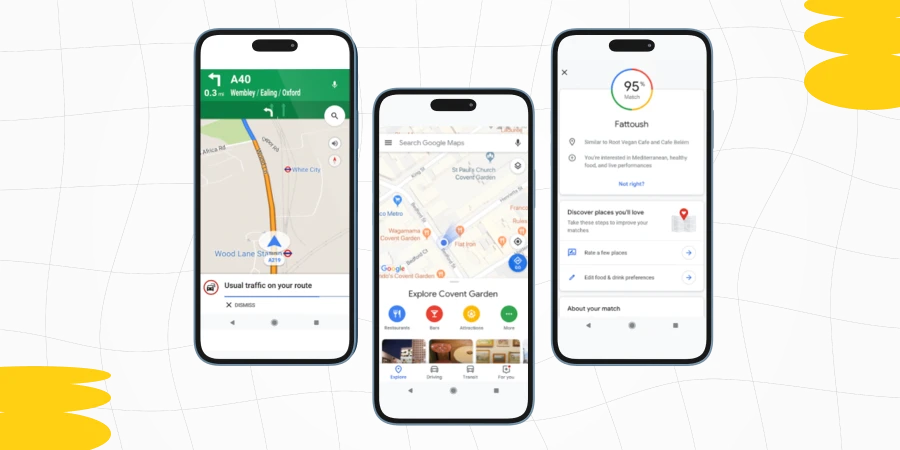
In UI/UX design examples, Google Maps is often celebrated for its exceptional UI/UX design, making it a go-to example, and here is why,
- Easy Navigation: The navigation in Google Maps is easy and user-friendly. Whether you’re looking for directions, searching for a specific location, or exploring a new area, the app guides you smoothly through each step.
- Consistent and Familiar Design: The design of Google Maps is consistent with other Google products, which makes it familiar to users who are already using other Google services.
- Interactive Map Features: The interactive nature of the map is a key aspect of its UI/UX design. Users can easily zoom in and out, switch between different views (like satellite or terrain), and see real-time traffic updates.
- Detailed Information and Recommendations: The app offers detailed information about places, including reviews, photos, and opening hours.
In summary, Google Maps is one of the best UI/UX design examples for beginners to understand how an app can be both functional and user-friendly.
Know More | A Complete UI/UX Designer Roadmap for Beginners
4. Uber
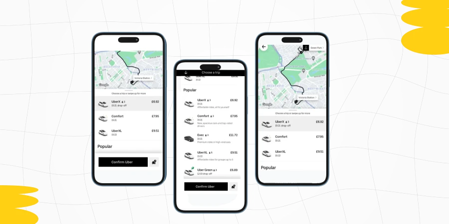
Uber’s UI/UX design is often highlighted as the prime UI/UX design example in the world of app design, especially for how it simplifies a complex service like ride-sharing. Here’s why:
- Real-Time Map Integration: The real-time map is a core feature of Uber’s UI. It shows your location, nearby Uber cars, and the route the driver will take. This transparency is comforting for users.
- Easy Payment Process: Uber simplifies the payment process by allowing users to pay through UPI or credit/debit card. This means you don’t have to worry about paying cash every time you take a ride, making the process smoother.
- Clear Communication Features: The app provides easy ways to contact your driver and vice versa. Whether it’s a call or a text, this feature enhances the safety and convenience of the service.
- Accessibility: Uber’s design is accessible, with features like larger buttons and voice-over support. These elements ensure that a wider range of users can comfortably use the app.
Uber’s UI/UX design is an excellent example of how an app can combine simplicity with functionality. Its focus on a clean interface, intuitive user journey, and real-time information makes it a standout in UI/UX design examples.
Explore 10 Real-World UI/UX Applications: The Magic of UI/UX
5. Amazon
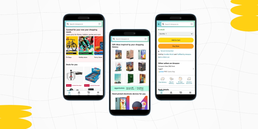
In this list of UI/UX design examples, Amazon is often cited as a strong example in the e-commerce sector, and here’s the reason why it is there on this UI/UX design examples list:
- User-Friendly Interface: Amazon’s layout is straightforward to navigate. When you visit the website or app, you’re greeted with a search bar, category menus, and various product listings.
- Personalized Recommendations: Amazon uses your browsing and purchase history to show personalized product recommendations. This not only helps users discover new products but also creates a more tailored shopping experience.
- Simplified Checkout Process: Amazon’s checkout process is streamlined and efficient. It minimizes the number of steps and information required to complete a purchase, making the process quicker and reducing the likelihood of cart abandonment.
- Easy Navigation with Categories and Filters: Products are organized into clear categories, and users can apply various filters (like price, brand, and customer ratings) to narrow down their search.
Amazon’s focus on easy navigation, personalized experiences, and comprehensive product information makes it a standout item in this list of UI/UX design examples.
Read: High Paying UI/UX Designer Jobs, Roles & Skills
6. Netflix
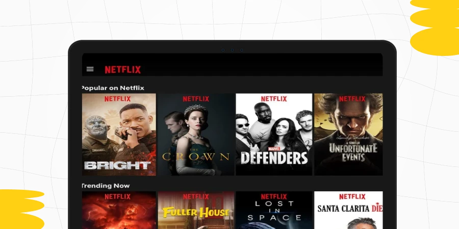
Netflix’s UI/UX design is widely acclaimed for its user-centric approach, making it an ideal case study for UI/UX design examples. Here’s a simple breakdown:
- Simple and Engaging Layout: When you open the app or website, you’re greeted with rows of movies and TV shows, organized by categories. This makes it easy for users to browse and find content.
- Personalized User Experience: One of the standout features of Netflix’s UI/UX design is its personalized recommendations. Based on your watching history, Netflix suggests shows and movies you might like.
- Consistent and Familiar Interface: Across all devices, Netflix maintains a consistent look and feel. This familiarity is comforting for users and makes switching between devices (like from phone to TV) a smooth experience.
- Clear Thumbnails and Previews: Each show and movie has a clear thumbnail image, and some even play a short preview when you hover over them.
Netflix’s UI/UX design is a great addition to this list of best UI/UX design examples as it depicts how an entertainment platform can be both easy to use and personalized.
Find Out Typography in User Interfaces: Basic Guide for Beginners [2024]
7. Pinterest
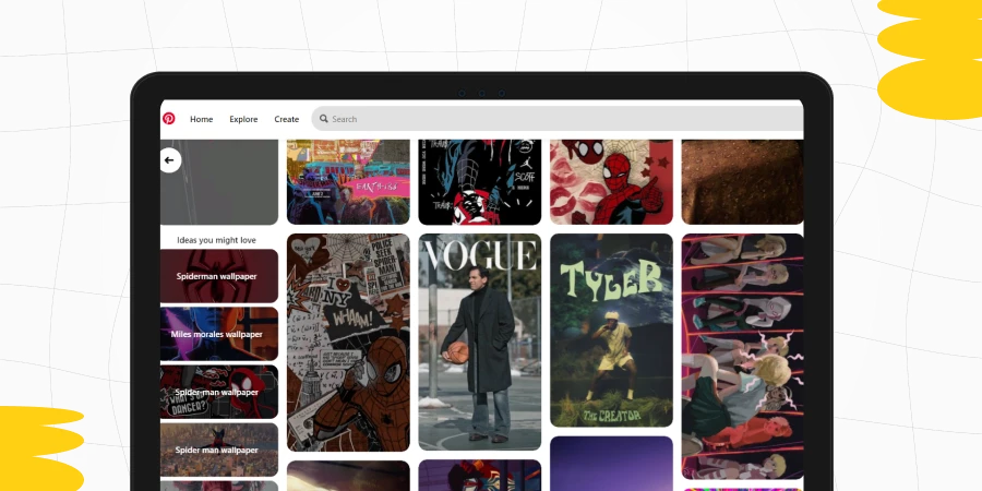
Pinterest is a case study in this UI/UX design examples list as it is a great example of how a visually driven platform can offer an engaging and intuitive user experience. Here’s a simple breakdown:
- Visual-First Layout: Pinterest’s layout is highly visual, with images (pins) taking center stage. When you open Pinterest, you’re immediately greeted with a grid of images, making it easy and enjoyable to browse.
- Infinite Scrolling: Pinterest employs infinite scrolling, which means as you scroll down, more and more pins keep appearing. This makes for an endless browsing experience, ideal for discovering new ideas and inspirations.
- Search Functionality with Filters: The search bar is a powerful tool on Pinterest. You can search for specific ideas, and then use filters to narrow down the results, making it easy to find exactly what you’re looking for.
- Visual Discovery Tools: Pinterest offers unique visual discovery tools, like the ability to search using images instead of words. This is particularly useful for finding things when you don’t have the words to describe them.
Pinterest’s focus on a visual-first layout, personalized content, and intuitive navigation makes it a standout in UI/UX design examples, especially for those who are new to the concepts of UI/UX.
8. Airbnb
Airbnb’s UI/UX design is often hailed as one of the best UI/UX design examples in the online marketplace industry because of these reasons
- Intuitive Search Functionality: The search process is streamlined and user-friendly. Users can easily input their destination, dates, and number of guests.
- High-Quality Images: Airbnb emphasizes high-quality images for listings. These images are the focal point of each listing, giving users a clear and attractive view of their potential accommodations.
- Easy Booking Process: The booking process on Airbnb is so easy and transparent. It guides users step by step, providing clear information about costs, cancellation policies, and host requirements.
- Map Integration: The integration of maps allows users to view the location of listings relative to areas of interest. This feature is especially useful for users unfamiliar with the destination.
Also Read: Why Should You Become a UI/UX Designer: Top 10 Reasons
Conclusion
In conclusion, by examining various UI/UX design examples from leading platforms like Airbnb, Pinterest, Netflix, Uber, Amazon, Google Maps, Spotify, Pinterest, Instagram, and others, you must’ve gained valuable insights into the principles of effective user interface and user experience design.
These UI/UX design examples highlight the importance of simplicity, intuitiveness, personalization, and responsiveness in creating user-centric platforms.
For anyone interested in UI/UX design, these UI/UX design examples serve as a powerful reference to the impact that thoughtful design can have on user satisfaction and overall success in the digital world.
Kickstart your UI/UX journey by enrolling in GUVI’s UI/UX Course where you will master technologies like AdobeXd, Illustrator, and Figma, and build interesting real-life UI/UX projects.
Alternatively, if you would like to explore Figma through a Self-paced course, try GUVI’s Figma’s certification course.
FAQs
UI provides the interface through which users interact with a product, while UX creates the overall experience. Both need to work harmoniously to deliver a seamless and engaging user experience.
Key elements include color scheme, typography, imagery, consistency, and clarity. These elements need to work together to create an aesthetically pleasing and functional interface.
These include usability, accessibility, efficiency in performing tasks, value for the user, and the ability to evoke a positive response from the user.
Trends can influence user expectations and standards, so staying up-to-date with them can be crucial. However, trends should be balanced with timeless design principles.
Yes, through techniques like gamification, persuasive design, and personalization, UI/UX design can guide and influence user behavior and decision-making.










Did you enjoy this article?