33 Interview Questions and Answers for UI/UX Designers
Mar 19, 2025 23 Min Read 50521 Views
(Last Updated)
Are you dreaming of becoming a UI/UX designer? Well, you’re in the right place! In today’s tech world, UI (User Interface) and UX (User Experience) designers are super important. They make sure the apps and websites we use every day are easy and fun to use. Because this job is so important, lots of people want to do it, and that means it’s not always easy to get a job in this field.
That’s why we’ve put together this blog. We want to help you nail your job interviews for UI/UX design roles. We’ll go through the most common questions that interviewers ask and give you tips on how to answer them. Plus, we’ll show you some example answers to give you an idea of what to say. Let’s get started and turn those tough interview questions into your chance to shine!
Table of contents
- Top UI/UX Designer Interview Questions
- How would you define UI/UX design?
- How is UI/UX design different from UI design?
- What is meant by design thinking?
- What makes a good UI/UX designer?
- What are the important skills for a UI/UX designer?
- Why did you choose UI/UX design?
- Explain your design process.
- What’s your favorite project that you’ve worked on?
- Tell me about a time when a project didn’t go as planned. How did you fix it?
- What is your design inspiration?
- How do you decide which features to add to your design?
- What research methods do you use?
- What are your biggest strengths?
- What is your biggest weakness?
- How do you handle negative feedback?
- Have you ever disagreed with your team’s recommendation? What did you do?
- What excites you about this position?
- Where do you see yourself in five years?
- What are some of the biggest challenges you’ve faced as a UI/UX designer?
- What design methods do you use?
- How do you deal with research and usability testing?
- Tell us about a design example that solved a business problem.
- Describe universal design.
- How would you make a product accessible to differently-abled users?
- What are your favorite apps or websites and why?
- Describe some design leaders that you follow?
- What are some UI/UX-related publications that you read?
- Do you have a product idea that you would want to build in the future?
- How would you improve the UI/UX of our product?
- How do you conduct the UI/UX evaluation of a product?
- What are the analytical tools and KPIs that you based your previous evaluations on?
- What are the key differences between designing for desktop and mobile?
- What tools do you use for prototyping?
- Tips on Acing Your UI/UX Interview
- Conclusion
- FAQs
- What is the difference between UI and UX design?
- What tools do UI/UX designers use for their work?
- What skills are important for a UI/UX designer?
Top UI/UX Designer Interview Questions
The following is a list of the most common questions that interviewers ask when they’re looking to hire a UI/UX designer:
1. How would you define UI/UX design?
What to look for:
- A clear understanding of both UI and UX concepts.
- Ability to distinguish between the two, while also explaining their interconnectivity.
- Insight into how UI/UX design impacts the user’s interaction with the product.
Example answer:
“UI design, or User Interface design, is about the visual elements of an app or a website – like buttons, icons, spacing, and typography. It’s focused on the look and feel, ensuring the product is aesthetically appealing and functional. UX design, or User Experience design, goes deeper into the user’s journey with the product. It’s about creating a smooth, efficient, and enjoyable experience for the user. It involves understanding user needs, creating wireframes and prototypes, testing designs, and continually improving the product. While UI is about how things look, UX is about how they work and feel from the user’s perspective. Both are essential for creating a product that’s not only good to look at but also delightful to use.”
Know More: What is UI/UX? Top Things to Know in 2024
2. How is UI/UX design different from UI design?
What to look for:
- Recognition of UI design as a part of the broader UI/UX design process.
- Understanding that UI focuses on the visual aspects of a product, while UI/UX involves a more holistic view including user experience.
- Awareness that UI/UX design includes considering the user’s entire journey, not just the visual interface.
Example answer:
“UI design is an important component of UI/UX design, but they aren’t the same thing. UI, or User Interface design, specifically refers to the design of the user interface, which includes the visual layout, graphics, and interactive elements like buttons and sliders. It’s about how the product looks and feels from a visual standpoint. On the other hand, UI/UX design encompasses both the UI and the overall User Experience. UX design is broader; it’s about understanding and designing the entire experience a user has with a product or service. This includes everything from the ease of navigation, the intuitiveness of the layout, to how easy it is for a user to complete their desired tasks. UI is about making the interface attractive and consistent, while UI/UX design is about the overall effectiveness and enjoyment of the user’s experience.”
As we proceed to the next phase, make sure you understand the fundamentals of UI/UX, which includes heuristic analysis, journey maps, testing, etc. If you want to explore more about it, join GUVI’s UI/UX Course with Placement Guidance. You’ll also learn about the tools used in UI/UX which are AdobeXD, Illustrator, Photoshop, Figma, and many more. Build some amazing real-time projects to get hands-on experience.
3. What is meant by design thinking?
What to look for:
- Understanding of design thinking as a problem-solving approach.
- Awareness that it involves empathy with users, defining problems, ideating solutions, prototyping, and testing.
- Recognition that design thinking is a user-centric approach that goes beyond traditional design aesthetics and functionality.
Example answer:
“Design thinking is a problem-solving process that focuses on understanding and empathizing with the users. It’s about stepping into the users’ shoes to grasp their needs, challenges, and motivations. The process starts with defining the problem from the user’s perspective. Then, it involves brainstorming creative solutions, followed by building prototypes and testing them with real users. This iterative process helps designers to continually refine and improve the solutions based on feedback. Design thinking isn’t just about making things look good; it’s a holistic approach that combines empathy, creativity, and rationality to meet user needs and solve complex problems in a user-friendly way. It’s widely used not only in UI/UX design but also in various fields to create innovative solutions.”
4. What makes a good UI/UX designer?
What to look for:
- A comprehensive understanding of both UI and UX principles.
- The ability to empathize with users and understand their needs.
- Creativity, problem-solving skills, and attention to detail.
- Effective communication and collaboration skills.
- Willingness to learn and adapt to new trends and technologies.
Example answer:
“A good UI/UX designer is someone who deeply understands the balance between visual design and user experience. They have a strong grasp of UI principles, such as color theory and typography, and UX principles like user research and usability testing. Empathy is key; they should be able to put themselves in the users’ shoes to understand their needs and pain points. Creativity and problem-solving skills are essential for designing innovative and effective solutions. Attention to detail ensures a polished and intuitive user interface.
Beyond technical skills, good UI/UX designers need strong communication skills to collaborate effectively with clients and team members. They should be able to clearly articulate their design decisions and be open to feedback and iteration. A good designer is also always learning – staying up-to-date with the latest design trends, tools, and technologies. This combination of technical skills, empathy, collaboration, and a mindset of continuous learning and improvement is what makes an exceptional UI/UX designer.”
Explore More About 8 Important Things a UI/UX Designer Should Know
5. What are the important skills for a UI/UX designer?
What to look for:
- Technical skills such as proficiency in design tools (like Sketch, Adobe XD, Figma).
- Understanding of fundamental design principles, including layout, typography, and color theory.
- Strong research skills, including user research and usability testing.
- Problem-solving and critical thinking skills.
- Effective communication and teamwork abilities.
- Adaptability and willingness to learn new trends and technologies.
Example answer:
“Important skills for a UI/UX designer include a mix of technical and soft skills. Technically, a UI/UX designer should be proficient in design tools like Sketch, Adobe XD, and Figma, and have a solid understanding of design principles such as layout, typography, and color theory. They should also be skilled in user research and usability testing to ensure that designs meet user needs.
On the soft skills side, problem-solving and critical thinking are important for creating innovative design solutions that effectively address user challenges. Good communication skills are essential to articulate design ideas clearly and collaborate effectively with team members and stakeholders. Teamwork skills are also important as UI/UX design often involves working closely with developers, product managers, and other designers.”
Know More: 10 Skills Required to Become a UI/UX Designer
6. Why did you choose UI/UX design?
What to look for:
- A genuine passion for design and creating user-centered experiences.
- An understanding of the impact of UI/UX design on users and businesses.
- Personal motivations or experiences that led to an interest in the field.
- A commitment to solving problems and improving user experiences.
Example answer:
“I chose UI/UX design because I have always been passionate about creating beautiful and functional products that make people’s lives easier. My interest began when I realized how a well-designed app or website can greatly improve the user’s experience and satisfaction. I was fascinated by the challenge of balancing aesthetics with usability and the impact that thoughtful design can have on both users and businesses.
What really solidified my decision was a project I worked on during my studies, where I had the opportunity to redesign a local non-profit’s website. The project showed me the real-world impact of UI/UX design – how intuitive navigation and a visually appealing interface could increase engagement and help the organization achieve its goals. This experience confirmed my passion for UI/UX design and my desire to pursue a career where I can use my creativity to solve problems and improve user experiences.”
7. Explain your design process.
What to look for:
- A structured and systematic approach to design.
- Inclusion of key phases such as research, ideation, prototyping, testing, and iteration.
- Understanding of user-centered design principles.
- Ability to adapt the process based on the project requirements.
- Clear articulation of how each step leads to informed design decisions.
Example answer:
“My design process is user-centered and follows several key phases, ensuring that the final product is both aesthetically pleasing and functionally effective. It starts with understanding the user and the problem space through research, which can include user interviews, surveys, and market analysis. This helps in building empathy and understanding the user’s needs and pain points.
Next, I move to ideation, where I brainstorm various design solutions. This phase involves sketching, creating user flows, and wireframing, which help in visualizing the potential solutions. I then develop these ideas into more refined prototypes using tools like Sketch or Figma.
After creating prototypes, I conduct usability testing to gather feedback. This is important as it helps in identifying any usability issues and understanding how real users interact with the design. Based on the feedback, I iterate on the design, making necessary refinements.
Throughout this process, I ensure constant communication with stakeholders and team members to align the design with business goals and technical constraints. My approach is flexible, allowing me to adapt the process to suit different types of projects and user needs.”
8. What’s your favorite project that you’ve worked on?
What to look for:
- Passion and enthusiasm for the project.
- A clear understanding of the project’s goals and outcomes.
- Ability to articulate the role they played in the project.
- Insight into the design challenges faced and how they were overcome.
- Reflection on what made the project meaningful or enjoyable.
Example answer:
“My favorite project so far has been redesigning the user interface for an educational app aimed at young learners. The goal was to make the app more engaging and intuitive for children aged 6-10. My role involved conducting user research, creating personas, designing the interface, and testing it with the target audience.
What made this project particularly exciting for me was the challenge of simplifying complex educational content into a format that was easily digestible and fun for kids. I used vibrant colors, interactive elements, and gamification to make the learning experience more enjoyable. I also worked closely with educators to ensure that the content was pedagogically sound.
A significant challenge was ensuring that the interface was not only engaging but also easy to navigate for young users. This involved several rounds of user testing and iteration. The feedback from the kids was incredibly insightful and helped shape the final design.
Seeing the positive impact of the app on children’s learning and receiving feedback from both kids and educators was immensely rewarding. It reinforced my passion for creating designs that are not only aesthetically pleasing but also make a real difference in users’ lives.”
Read Also: 12 Unique UI/UX Project Ideas to Boost Your Portfolio
9. Tell me about a time when a project didn’t go as planned. How did you fix it?
What to look for:
- Ability to acknowledge and take responsibility for challenges or mistakes.
- Problem-solving skills and adaptability in the face of unexpected issues.
- Clear thinking and decisive action to rectify the situation.
- Learning from the experience and implementing changes to prevent future issues.
Example answer:
“There was a time when I was working on a website redesign project for a retail client. Midway through, we realized that the navigation structure we designed was not as intuitive as we initially thought. This was highlighted during user testing, where participants struggled to find key information.
Realizing this, I took immediate action to address the issue. First, I gathered the project team to discuss the feedback and brainstorm potential solutions. We decided to simplify the navigation menu and reorganize the content to make it more user-friendly.
I led the effort to create new wireframes and prototypes, reflecting these changes. We conducted another round of user testing to validate our new design approach, which received positive feedback from users for its simplicity and ease of use.
This experience taught me the importance of continuous testing and being open to feedback. It also highlighted the need for flexibility in design projects. Since then, I have always made sure to build in extra time for testing and iteration in my project timelines.”
10. What is your design inspiration?
What to look for:
- Sources of inspiration that are relevant and thoughtful.
- Ability to draw from a wide range of influences, including other designers, art, nature, culture, and technology.
- Understanding of how these inspirations influence their design approach and style.
- Reflection on staying current with design trends while maintaining a unique perspective.
Example answer:
“My design inspiration comes from a variety of sources. I am particularly inspired by the work of Dieter Rams, whose principles of good design focus on simplicity, functionality, and longevity. This has influenced my approach to creating designs that are not only visually appealing but also user-friendly and sustainable.
I also find inspiration in everyday life, from the architecture around me to the efficiency and simplicity of nature’s designs. For example, the way light and shadow interact in nature often gives me ideas for playing with contrast and color in my work.”
11. How do you decide which features to add to your design?
What to look for:
- A user-centered approach to feature selection.
- Consideration of the project’s goals and target audience.
- Ability to prioritize features based on importance and feasibility.
- Understanding of balancing functionality with simplicity.
- Involvement in user research and feedback to inform decisions.
Example answer:
“When deciding which features to add to a design, my primary focus is always on the user’s needs and the goals of the project. I start by conducting thorough user research to understand what the target audience really needs and values in the product. This involves user interviews, surveys, and analyzing data on user behavior.
Once I have a clear understanding of the users’ needs, I prioritize features based on how well they align with the project goals and user expectations. I use techniques like feature mapping and user story creation to outline the potential impact of each feature. This also helps in identifying the must-have features versus nice-to-have ones.
I also consider the technical feasibility and the resources available. It’s important to balance adding innovative features with ensuring the design remains intuitive and not overloaded. My aim is always to create a seamless and efficient user experience, so I often opt for simplicity and ease of use over adding too many features.
Throughout this process, I maintain close collaboration with the development team and stakeholders to ensure that the feature set aligns with the project’s scope and timeline. This collaborative approach ensures that the final design is not only user-focused but also practical and achievable.”
12. What research methods do you use?
What to look for:
- Familiarity with a variety of research methods suitable for different stages of the design process.
- Ability to choose appropriate methods based on the project’s requirements.
- Understanding of both qualitative and quantitative research techniques.
- Experience with user interviews, surveys, usability testing, and data analysis.
- Skills in synthesizing research findings into actionable insights.
Example answer:
“In my design process, I use a mix of qualitative and quantitative research methods, selecting those that best fit the project’s specific needs. For initial understanding and empathy-building, I often conduct user interviews and ethnographic studies. This helps me gain deep insights into the users’ needs, motivations, and pain points.
I also use surveys for gathering quantitative data, which is particularly useful for validating assumptions about a larger user base. Surveys help in understanding broader trends and preferences, complementing the in-depth insights from interviews.
When it comes to evaluating designs, I rely heavily on usability testing. This involves observing users as they interact with prototypes, which helps in identifying any usability issues and areas for improvement. I also analyze usage data if available, looking for patterns that indicate how users are interacting with the current design.
In addition to these methods, I often conduct A/B testing for more data-driven design decisions, especially when fine-tuning UI elements. After gathering all this data, I synthesize the findings to draw actionable insights that inform the design process, ensuring that the final product is well-aligned with user needs and expectations.”
13. What are your biggest strengths?
What to look for:
- Clear and confident articulation of personal strengths.
- Relevance of these strengths to the role of a UI/UX designer.
- Examples of experiences that demonstrate these strengths in action.
- A balance between technical skills and soft skills.
Example answer:
“One of my biggest strengths is my ability to empathize with users. This skill has been important in my role as a UI/UX designer, as it allows me to truly understand and anticipate the needs and challenges of the users. In a recent project, my ability to empathize with end-users led to the redesign of a key feature, significantly improving user satisfaction and engagement.
Another strength is my proficiency in a variety of design tools like Sketch, Adobe XD, and Figma, combined with a strong understanding of design principles. This technical expertise enables me to quickly and effectively bring design concepts to life.
I also consider my problem-solving skills as a key strength. In the design field, challenges are inevitable, and my ability to think critically and creatively has helped me overcome complex design problems. For example, I successfully navigated a challenging project with tight deadlines by devising a streamlined design process, which not only met the deadlines but also delivered a high-quality user experience.”
14. What is your biggest weakness?
What to look for:
- Self-awareness and honesty in identifying a genuine weakness.
- Evidence of steps taken to address or mitigate this weakness.
- A weakness that is not a fundamental flaw for the role of a UI/UX designer.
- Framing the weakness in a way that shows a proactive approach to personal and professional growth.
Example answer:
“One area I’m actively working on is my tendency to get too absorbed in the details of a design. While this attention to detail often leads to high-quality outcomes, I’ve found that it can sometimes slow down the process, especially in the early stages of a project. I’ve recognized that it’s important to first focus on the broader strokes of a design before getting into the finer points.
To address this, I’ve been practicing more iterative design methods, where I start with broader sketches and gradually refine the design. This approach helps me balance my detail-oriented nature with the need for efficiency and timely progress in projects. I’ve also found it useful to set specific time limits for each phase of the design process, which helps me stay focused and on track.
This effort to balance detail-oriented work with efficiency has not only improved my workflow but also improved my ability to collaborate with teams, as it aligns my pace more closely with the project timelines.”
15. How do you handle negative feedback?
What to look for:
- A positive and constructive attitude towards negative feedback.
- Understanding that feedback is an opportunity for growth and improvement.
- Specific strategies for responding to and learning from negative feedback.
- Ability to remain professional and not take feedback personally.
- Examples of how you’ve used negative feedback to improve their work.
Example answer:
“I view negative feedback as an essential part of my growth as a UI/UX designer. It’s an opportunity to see my work from a different perspective and identify areas for improvement. When I receive negative feedback, my first step is to listen actively and understand the concerns being raised. I ask clarifying questions to make sure I fully grasp the issues and where the feedback is coming from.
I then take some time to process the feedback, especially if it’s extensive or particularly critical. This helps me approach the situation objectively and formulate a constructive response. I try to identify the key takeaways and think about how I can apply them to improve my work.
For example, in a past project, I received feedback that the user interface I designed was visually appealing but not intuitive enough for users. I took this feedback seriously, conducted additional user testing, and made the necessary adjustments to improve usability. This experience taught me the importance of balancing aesthetic appeal with functionality and user-friendliness.
I handle negative feedback by listening, understanding, processing, and then acting on it to refine my designs. I believe this approach not only helps in improving my work but also in building strong, collaborative relationships with colleagues and clients.”
16. Have you ever disagreed with your team’s recommendation? What did you do?
What to look for:
- Ability to handle disagreements professionally and constructively.
- Emphasis on open communication and collaboration.
- Willingness to listen to others’ perspectives while also presenting their own viewpoint.
- Problem-solving skills to find a middle ground or a mutually agreeable solution.
- Examples demonstrating respect for team dynamics and achieving a positive outcome.
Example answer:
“Yes, there have been occasions when I’ve disagreed with my team’s recommendations. In a recent project, the team suggested a particular user flow that I believed could be further optimized. Instead of outright dismissing their idea, I first sought to understand their perspective and reasoning behind the recommendation.
Once I understood their point of view, I presented my concerns and suggested an alternative approach, supported by user research and data. I proposed that we create prototypes for both the approaches and conduct A/B testing to see which one performed better.
This approach allowed us to make an evidence-based decision rather than just going by opinions. It turned out that the hybrid of both ideas led to a more efficient user flow. This experience reinforced the value of collaborative problem-solving and how combining different perspectives often leads to the best solutions.
In such situations, I believe it’s important to maintain open communication, respect for each other’s views, and a focus on the common goal of delivering the best possible user experience.”
17. What excites you about this position?
What to look for:
- Enthusiasm and genuine interest in the role and the company.
- Understanding of the specific aspects of the job that align with your skills and career goals.
- Awareness of the company’s products, culture, or mission, and how you relate to it.
- Desire for growth opportunities and challenges that the position offers.
- Ability to connect personal passion with the professional aspects of the role.
Example answer:
“What truly excites me about this position is the opportunity to work on innovative and user-centric design projects that align perfectly with my passion for creating intuitive and impactful user experiences. Your company’s commitment to pushing the boundaries in digital design and its user-first approach resonates deeply with my professional philosophy.
I am particularly impressed by your recent projects, which showcase a blend of creativity and functionality, and I am eager to contribute to such dynamic and forward-thinking work. The chance to work with a team of talented designers and learn from their diverse experiences is something I look forward to.
Another aspect that excites me is the potential for growth and development. I understand that your company encourages continuous learning and experimentation, which is important for staying at the cutting edge of UI/UX design. This aligns with my personal goal of always evolving as a designer and staying ahead in the field.
I am excited about the opportunity to bring my unique skills and perspective to your team and to grow with a company that is making a significant impact in the world of digital design.”
18. Where do you see yourself in five years?
What to look for:
- Clear and realistic career goals that demonstrate ambition and commitment.
- Alignment of these goals with the opportunities the company can provide.
- Understanding of the necessary steps to achieve these goals, such as skill development or gaining specific experiences.
- A balance between personal aspirations and contributions to the company.
- Indications that you are looking for a long-term fit with the company.
Example answer:
“In five years, I see myself having grown significantly both in skills and in my understanding of user-centered design. My goal is to evolve into a senior UI/UX designer role, where I can take on more complex projects and have a substantial impact on product development. I hope to lead design projects that challenge me and push the boundaries of what’s possible in creating intuitive and engaging user experiences.
I also aim to be a mentor to junior designers, sharing the knowledge and experiences I’ve gained. I believe in continuous learning, so I plan to keep up with the latest trends in design and technology, perhaps even pursuing specialized training or certification in areas like interaction design or user research.
I am particularly excited about the prospect of growing within this company. I see a lot of alignment between my career goals and the innovative projects your team is working on. I’m enthusiastic about the opportunity to contribute to the company’s success and grow with the team, ideally taking on more leadership responsibilities as I develop my skills and experience.”
Explore this to learn more about The Future and Scope of UI/UX Design: A Comprehensive Overview
19. What are some of the biggest challenges you’ve faced as a UI/UX designer?
What to look for:
- Evidence of significant challenges that are relevant to UI/UX design.
- Understanding of how these challenges impact the design process and user experience.
- Strategies used to overcome these challenges.
- Ability to learn and grow from these challenges.
- Examples that show resilience, problem-solving skills, and adaptability.
Example answer:
“One of the biggest challenges I’ve faced as a UI/UX designer was designing for diverse user groups with varying needs and expectations. In a project for a healthcare app, I had to ensure that the design was accessible and intuitive for all users, from tech-savvy teenagers to elderly patients with limited tech experience. Balancing these diverse needs while maintaining a clean and engaging interface was a complex task.
To tackle this, I conducted extensive user research, including interviews and surveys across different user groups. I collaborated with healthcare professionals to understand each group’s needs. Based on this research, I created user personas and tailored the design to be flexible and adaptable to different user abilities and preferences. This involved implementing features like adjustable text sizes and easy-to-understand icons.
Another challenge was staying updated with the rapidly evolving technology and design trends in UI/UX. To keep up, I’ve established a routine of continuous learning through online courses, webinars, and staying engaged with the design community.
These challenges have taught me the importance of thorough research, empathy in design, and the need for lifelong learning in the field of UI/UX design. They’ve helped me develop a more holistic approach to design and an adaptive mindset, which are important in this ever-evolving field.”
20. What design methods do you use?
What to look for:
- Familiarity with a range of design methodologies and when to apply them.
- Understanding of user-centered design processes.
- Ability to integrate different methods to create an effective design strategy.
- Examples of how these methods have been successfully applied in past projects.
- Adaptability in using different methods based on project requirements.
Example answer:
“In my design work, I use a variety of methods, tailoring my approach to fit the specific needs of each project. One foundational method I use is the Design Thinking process, which involves empathizing with users, defining the problem, ideating solutions, prototyping, and testing. This user-centric approach helps ensure that the final design is both innovative and aligned with user needs.
For user research, I use methods like user interviews, surveys, and persona creation. These help me gain a deep understanding of the users and their context. When it comes to ideation, I often use brainstorming sessions and sketching, which help in generating a wide range of ideas.
In the prototyping phase, I use tools like Figma and Adobe XD to create both low-fidelity and high-fidelity prototypes. This allows for rapid iteration and refinement of designs based on user feedback and usability testing.
My approach is flexible, allowing me to combine and adapt these methods to meet the unique challenges of each project.”
Also Read User Flow in UX Design: 11 Important Steps to Look After
21. How do you deal with research and usability testing?
What to look for:
- A clear understanding of the role of research and usability testing in the design process.
- Ability to conduct and interpret various research methods effectively.
- Strategies for incorporating user feedback into design iterations.
- Examples of adapting design based on research findings.
- Emphasis on the importance of user-centered design decisions.
Example answer:
“In my approach to UI/UX design, research and usability testing are fundamental components. I start the research process by defining the goals and objectives, ensuring that the focus aligns with the project’s needs. Depending on the project, I utilize a mix of qualitative and quantitative research methods, such as user interviews, surveys, observation, and analysis of existing user data. This helps me gather insights into user behaviors, needs, and motivations.
Once I have a prototype, I move to usability testing. My focus here is on how real users interact with the design. I typically conduct moderated or unmoderated testing sessions, depending on the project scope. During these sessions, I observe how users navigate the interface, paying close attention to areas where they encounter difficulties or confusion. I also gather verbal feedback and reactions to understand their experience better.
After the testing phase, I thoroughly analyze the data collected to identify patterns and key insights. This analysis is critical in informing the next steps in the design process. Based on the findings, I make necessary iterations to the design, aiming to improve usability and overall user experience.
Throughout this process, I ensure to keep an open mind and remain flexible, ready to adapt the design based on user feedback. This user-centric approach has been helpful in creating designs that not only meet but exceed user expectations.”
22. Tell us about a design example that solved a business problem.
What to look for:
- Understanding of how design can address and solve business problems.
- Ability to link design decisions to business outcomes.
- Examples of creative problem-solving through design.
- Reflection on the impact of the design on the business’s goals.
- Insight into the process of identifying the problem, developing a solution, and measuring success.
Example answer:
“One project that stands out is when I worked on a redesign for an e-commerce app. The business problem was a high cart abandonment rate, which was impacting sales. After conducting user research and analyzing the data, I discovered that the checkout process was too lengthy and complicated, causing frustration among users.
To address this, I redesigned the checkout process with a focus on simplicity and efficiency. I reduced the number of steps, streamlined the information required, and introduced a progress bar to give users a clear sense of how far they were in the process. I also optimized the design for mobile users, as analytics showed a majority of users shopped on mobile devices.
After implementing these changes, we saw a significant decrease in cart abandonment rates and a corresponding increase in sales. This project was a clear example of how thoughtful UI/UX design can directly solve a business problem, in this case, boosting sales by improving the user experience. It also highlighted the importance of aligning design decisions with business objectives and using data-driven insights to inform the design process.”
Know more about reading 8 Steps In The UX Design Process You Should Know
23. Describe universal design.
What to look for:
- An understanding of universal design as an inclusive design philosophy.
- Awareness of how universal design aims to make products and environments accessible to all people, regardless of age, disability, or other factors.
- Ability to explain the principles of universal design in a clear and concise manner.
- Recognition of the importance of universal design in creating accessible user experiences.
Example answer:
“Universal design is a design philosophy focused on making products and environments accessible and usable by as many people as possible, regardless of their age, ability, or status in life. It’s about creating solutions that meet the needs of a diverse user base, including people with disabilities.
There are seven principles of universal design, which include equitable use, flexibility in use, simple and intuitive use, perceptible information, tolerance for error, low physical effort, and size and space for approach and use. These principles guide designers in creating products that are not only accessible but also convenient and enjoyable for a wide range of users.
For example, when designing a website following universal design principles, I would ensure that it is navigable and readable for users with visual impairments, which could mean implementing features like screen reader compatibility and adjustable text sizes. It’s not just about accommodating disabilities; it’s about creating a seamless and inclusive experience for everyone.”
24. How would you make a product accessible to differently-abled users?
What to look for:
- Knowledge of accessibility standards and guidelines (like WCAG).
- Practical strategies for designing accessible products.
- Understanding of the diverse needs of differently-abled users.
- Examples of specific design elements that improve accessibility.
- Insight into the importance of inclusive design in reaching a wider audience.
Example answer:
“To make a product accessible to differently-abled users, I follow established accessibility standards like the Web Content Accessibility Guidelines (WCAG) and consider a wide range of needs in my design. For users with visual impairments, I ensure high contrast between text and background and use alt text for images. This not only helps users who rely on screen readers but also those with color vision deficiencies.
For auditory impairments, I include captions or transcripts for video and audio content. It’s also important to design for users with motor difficulties, which means ensuring that all interactive elements are easy to click and navigate, potentially also offering keyboard navigation alternatives.
I also consider cognitive disabilities by making content clear and straightforward, avoiding complex jargon, and providing easy navigation. I conduct user testing with differently-abled users to get direct feedback on the accessibility of the design.
Incorporating these practices doesn’t just help differently-abled users; it generally results in a more user-friendly product for everyone. Accessible design is good design, and it’s essential for creating inclusive products that can be used by as many people as possible.”
25. What are your favorite apps or websites and why?
What to look for:
- Insight into your preferences and interests in digital products.
- Understanding of what makes these apps or websites stand out in terms of design, usability, or functionality.
- Ability to articulate specific design elements that appeal to you.
- Reflection on how these apps or websites influence or inspire your own design work.
Example answer:
“One of my favorite apps is ‘Notion’, primarily for its clean and intuitive user interface. I appreciate how it seamlessly integrates various functionalities like note-taking, task management, and database creation without overwhelming the user. The minimalist design, combined with powerful customization options, makes it not only functional but also a pleasure to use.
Another website I frequently visit and admire is ‘Airbnb’. It excels in creating a user-friendly experience, from the ease of navigation to the engaging visuals. I’m particularly impressed with their use of large, appealing images and how they provide a seamless booking experience. The way they handle information architecture, especially considering the vast amount of content, is amazing.
These apps and websites influence my design approach significantly. They show how powerful and effective design can be in enhancing user experience. I often draw inspiration from their attention to detail, aesthetics, and the way they balance functionality with simplicity.”
26. Describe some design leaders that you follow?
What to look for:
- Knowledge of prominent figures in the design community.
- Understanding of their contributions to the field of UI/UX design or related areas.
- Ability to articulate why these leaders are inspirational or influential.
- Insight into how following these leaders impacts your own design work.
Example answer:
“I follow several design leaders who have significantly influenced my approach to UI/UX design. One of them is Don Norman, whose work on user-centered design and usability has been foundational in the field. His book, ‘The Design of Everyday Things,’ fundamentally changed how I think about designing for user experience.
Another leader I admire is Julie Zhuo, the former VP of Product Design at Facebook. Her insights into building products, leading design teams, and understanding user behavior have been incredibly valuable. Her book, ‘The Making of a Manager,’ provides practical advice that goes beyond design into leadership and team management.
I also follow Dieter Rams closely, a legendary industrial designer whose principles of good design — emphasizing simplicity, functionality, and sustainability — continue to inspire my work in digital design.
Following these leaders allows me to stay updated with the latest trends and philosophies in design. Their work challenges me to think deeper about my design choices and to continually strive for simplicity and user-centricity in my projects.”
27. What are some UI/UX-related publications that you read?
What to look for:
- Awareness and engagement with current UI/UX design literature and online resources.
- Knowledge of reputable sources for design trends, best practices, and industry news.
- Evidence of a commitment to continuous learning and staying updated in the field.
Example answer:
“I regularly read a variety of UI/UX-related publications to stay updated with the latest trends, insights, and best practices in the field. ‘Smashing Magazine’ is one of my go-to resources for in-depth articles on design techniques, coding, and best practices. They provide a great blend of practical tips and thought leadership in the field of web design and development.
Another favorite is ‘Nielsen Norman Group’s articles and reports. Their research on user experience, including usability studies and guidelines, is important for any UI/UX professional aiming to create user-centered designs.
I follow ‘A List Apart’ and ‘InVision’s blog’, both of which provide insightful content on design process, collaboration, and strategy. These publications not only help me keep up with the latest trends and tools but also inspire me to think creatively and strategically about my own design projects.”
28. Do you have a product idea that you would want to build in the future?
What to look for:
- Evidence of creative and innovative thinking.
- A clear and concise description of the product idea.
- Understanding of how the product meets a specific user need or solves a problem.
- Consideration of the practical aspects of developing the product, such as technology, market demand, and user experience.
- Enthusiasm and passion for the idea.
Example answer:
“Yes, I have a product idea that I’m really passionate about – it’s a mobile app designed to help people manage their mental wellness more effectively. The concept revolves around combining mood tracking with AI-driven insights to provide personalized mental health support. Users can log their mood and activities, and over time, the app will identify patterns and triggers, offering tailored advice and coping strategies.
What sets this app apart is its focus on preventative mental health care rather than just crisis management. The app would also offer a community feature, connecting users with others for mutual support, and resources from mental health professionals.
I’ve conducted preliminary research and found that while there are similar apps on the market, many lack personalization and proactive features. I believe there’s a significant opportunity to create a tool that not only helps individuals manage their mental health day-to-day but also contributes to a broader understanding of mental wellness.
Developing this app would require a careful balance of empathetic UX design, data privacy measures, and cutting-edge AI technology. It’s a project I’m excited about and hope to bring to fruition in the future.”
29. How would you improve the UI/UX of our product?
What to look for:
- A thoughtful and systematic approach to evaluating and improving UI/UX.
- Specific recommendations based on your assessment of the product.
- Consideration of user needs and pain points.
- A focus on aligning UI/UX improvements with the company’s goals and values.
- An understanding of the importance of user testing and feedback in the improvement process.
Example answer:
“I would approach the improvement of your product’s UI/UX through an analysis of the current design and user feedback. Firstly, I would conduct user interviews and gather quantitative data to identify pain points and areas of friction in the user journey. This data would provide valuable insights into the specific issues that need addressing.
One area I would focus on is simplifying the onboarding process. Ensuring that new users can easily understand the product’s value and how to get started is important. I would recommend creating a more user-friendly and intuitive onboarding flow, possibly with interactive tutorials or guided tours.
Next, I would work on improving the product’s overall visual design. This might involve refining the color scheme, typography, and layout to create a more aesthetically pleasing and user-friendly interface. I would prioritize responsive design to ensure a consistent and enjoyable experience across different devices.
Using micro-interactions and animations can also make the user experience more engaging and delightful. These subtle design elements can guide users, provide feedback, and improve the overall usability of the product.
Lastly, I would advocate for a user-centered design approach, involving regular usability testing and collecting user feedback to iterate on design improvements. This iterative process ensures that the UI/UX is continually evolving to meet user needs and align with your company’s objectives.
My goal would be to create a UI/UX that not only addresses current pain points but also sets a foundation for future growth and user satisfaction.”
30. How do you conduct the UI/UX evaluation of a product?
What to look for:
- A systematic approach to evaluating the user interface and user experience of a product.
- Consideration of both qualitative and quantitative evaluation methods.
- Awareness of the importance of usability testing and user feedback.
- Knowledge of usability heuristics and best practices.
- An understanding of the iterative nature of UI/UX evaluation.
Example answer:
“Conducting a UI/UX evaluation of a product involves a combination of qualitative and quantitative methods to assess its usability and user experience. Here’s a general outline of the process:
Define Evaluation Goals: First, I establish clear goals for the evaluation. What aspects of the UI/UX are we assessing? Are we looking for usability issues, user satisfaction, or both?
Heuristic Evaluation: I begin with a heuristic evaluation, applying established usability heuristics and best practices to the product. This helps identify potential issues in the design, such as navigation challenges, consistency, and clarity.
Usability Testing: Usability testing is an important step. I recruit representative users and create scenarios or tasks that reflect typical user interactions with the product. During testing, I observe users’ behavior, collect feedback, and note any usability issues they encounter.
User Surveys: Surveys can provide quantitative data on user satisfaction and preferences. I design surveys to gather feedback on specific aspects of the product’s UI/UX, such as ease of use, aesthetics, and overall satisfaction.
Analytics Data: I analyze analytics data to gain insights into user behavior within the product. This data can reveal drop-off points, common user journeys, and areas where users struggle.
Competitor Analysis: I compare the product’s UI/UX with that of competitors or industry leaders. This benchmarking helps identify areas where we can improve and stay competitive.
Expert Review: In addition to user feedback, I conduct an expert review to provide a more comprehensive evaluation. This involves analyzing the product from a design and usability perspective.
Synthesize Findings: After collecting data from these methods, I synthesize the findings to identify common patterns and prioritize issues based on severity and impact on the user experience.
Iterative Improvement: UI/UX evaluation is an iterative process. I work with the design and development teams to implement improvements and then reevaluate the product to ensure that the changes have had the desired impact.
Continuous Monitoring: UI/UX evaluation is ongoing. Even after the initial evaluation and improvements, it’s important to continuously monitor user feedback and analytics to make data-driven design decisions.”
This approach ensures that the product’s UI/UX is continually refined to meet user needs and expectations.”
Explore 10 Real-World UI/UX Applications: The Magic of UI/UX
31. What are the analytical tools and KPIs that you based your previous evaluations on?
What to look for:
- Familiarity with common analytical tools used in UI/UX evaluation.
- Understanding of key performance indicators (KPIs) relevant to UI/UX.
- Evidence of using data to drive design decisions.
- Ability to select appropriate tools and KPIs based on the goals of the evaluation.
Example answer:
“In previous UI/UX evaluations, I’ve relied on a combination of analytical tools and key performance indicators (KPIs) to gather insights and measure the effectiveness of design changes. Here are some of the tools and KPIs I’ve used:
Analytical Tools:
Google Analytics: This tool is important for tracking user behavior within a product. It provides data on user traffic, page views, bounce rates, and user paths, helping us understand how users interact with the interface.
Hotjar: Hotjar offers heatmaps, session recordings, and user surveys. Heatmaps show where users click, move, or scroll on a page, while session recordings allow us to observe individual user interactions. User surveys provide qualitative feedback.
Usability Testing Tools: Platforms like UsabilityHub or UserTesting.com allow us to conduct remote usability testing and collect user feedback.
A/B Testing Platforms: Tools like Optimizely or VWO (Visual Website Optimizer) enable us to run A/B tests to compare the performance of different design variations.
Key Performance Indicators (KPIs):
Conversion Rate: This KPI measures the percentage of users who complete a desired action, such as signing up or making a purchase. It’s an important indicator of how effective the UI/UX is in driving user actions.
Bounce Rate: A high bounce rate can indicate that users are leaving a page quickly, possibly due to a poor user experience. It’s important to track and reduce bounce rates.
Task Success Rate: In usability testing, I measure the percentage of users who successfully complete specific tasks. This KPI helps identify usability issues.
User Satisfaction (CSAT or NPS): Surveys measuring user satisfaction, such as Customer Satisfaction (CSAT) or Net Promoter Score (NPS), provide insights into how users perceive the product’s UI/UX.
Time on Page: Understanding how much time users spend on a page helps gauge engagement and whether the content is engaging.
Error Rate: Tracking the frequency of user errors or mistakes can pinpoint areas of the UI/UX that need improvement.
Retention Rate: This KPI measures how well the UI/UX retains users over time. High retention rates indicate that users find value in the product.
The selection of tools and KPIs depends on the specific goals of the evaluation. For example, if we’re focused on improving conversion rates, we would prioritize tools and KPIs related to user actions and conversions. Data from these sources guide our design decisions, helping us create a better user experience.”
32. What are the key differences between designing for desktop and mobile?
What to look for:
- Understanding of the unique characteristics and constraints of desktop and mobile devices.
- Consideration of user behaviors and expectations on each platform.
- Knowledge of responsive design principles.
- Ability to adapt and optimize UI/UX for different screen sizes and interaction methods.
Example answer:
“Designing for desktop and mobile platforms involves addressing distinct challenges and considerations due to differences in screen size, user behavior, and interaction methods. Here are the key differences between designing for desktop and mobile:
1. Screen Size and Resolution
Desktop: Desktop screens are larger, with higher resolutions. This allows for more content to be displayed simultaneously.
Mobile: Mobile screens are smaller and have limited screen real estate. Designers must prioritize content and interactions.
2. Navigation
Desktop: Desktop websites often have complex navigation menus and multi-level dropdowns.
Mobile: Mobile navigation requires simplified menus, often using navigation drawers, tabs, or bottom navigation for ease of use on smaller screens.
3. Interaction Methods
Desktop: Desktop users interact with a mouse or trackpad, allowing for precise clicks and hovers.
Mobile: Mobile users rely on touch gestures, making interactions more tactile and gesture-based.
4. User Context
Desktop: Desktop users may have longer attention spans and may engage with content in a more focused environment.
Mobile: Mobile users are often on the go, seeking quick access to information or completing tasks in shorter sessions.
5. Responsive Design
Desktop: Desktop designs may have more complex layouts, columns, and sidebars.
Mobile: Mobile designs prioritize responsive layouts that adapt to different screen sizes. Content stacking, flexible grids, and font scaling are common techniques.
6. Load Times
Desktop: Desktop devices typically have faster internet connections, allowing for larger media and assets.
Mobile: Mobile users may have slower connections, necessitating optimized images and efficient loading.
7. Touch Targets
Desktop: Desktop interfaces don’t require large touch targets, as mouse pointers offer precision.
Mobile: Mobile UIs must feature larger touch targets to accommodate fingers, reducing the risk of misclicks.
8. Gestures
Desktop: Desktop interfaces rarely rely on gestures for navigation.
Mobile: Mobile apps often use swipe, pinch, and other gestures for interactions.
9. Contextual Design
Desktop: Desktop design may focus on creating a comprehensive browsing experience.
Mobile: Mobile design often uses location-based or context-aware features.
Effective UI/UX designers understand these differences and tailor their designs to meet the unique needs of each platform. A user’s experience should feel natural, whether they are using a desktop or mobile device.”
33. What tools do you use for prototyping?
What to look for:
- Familiarity with a range of prototyping tools commonly used in UI/UX design.
- Ability to select the appropriate tool for the project’s needs.
- Knowledge of industry-standard prototyping tools.
- Experience in creating interactive and user-friendly prototypes.
Example answer:
“I’ve had experience with a variety of prototyping tools, and my choice of tool depends on the specific project requirements and collaboration preferences. Some of the prototyping tools I’m proficient in are:
Figma: Figma is one of my go-to tools for prototyping and design collaboration. Its cloud-based nature allows for real-time collaboration with team members, making it ideal for remote work. I use Figma to create interactive prototypes with transitions and animations.
Also, if you want to explore Figma through a Self-paced course, try GUVI’s Figma certification course.
Sketch: Sketch is excellent for macOS-based design and prototyping. I’ve used Sketch for creating high-fidelity prototypes with its user-friendly interface and plugins that improve its capabilities.
Adobe XD: Adobe XD is another tool I’m proficient in, particularly when working on projects that involve Adobe Creative Cloud integration. It’s versatile for both design and prototyping, and I can create interactive experiences within the same platform.
InVision: InVision is a dedicated prototyping and collaboration tool. I’ve used it to transform static designs into interactive prototypes with transitions and user flows. It’s also great for user testing and feedback collection.
Axure RP: For more complex prototypes and interactions, I turn to Axure RP. It’s an advanced prototyping tool that allows for dynamic and conditional interactions, making it suitable for simulating complex user journeys.
Balsamiq: When wireframing and low-fidelity prototyping are needed, Balsamiq is my choice. It’s straightforward and helps convey early design concepts without getting into the details.
Proto.io: Proto.io is a web-based prototyping tool that excels in creating interactive and responsive prototypes. It’s suitable for both web and mobile app projects.
Marvel: Marvel is a user-friendly tool for creating quick and simple prototypes. It’s often used for rapid prototyping and user testing.
Principle: For Mac users, Principle is an animation-focused prototyping tool that I use to create realistic and interactive animations and transitions in my prototypes.
My choice of prototyping tool depends on the project’s complexity, team collaboration preferences, and the need for user testing. I aim to select the most appropriate tool to effectively convey the user experience and iterate on design improvements.”
Want to design amazing websites and apps? GUVI’s UI/UX Design Course is perfect for you. With live classes, video lessons, and real projects, you’ll learn a lot. Enrol now!
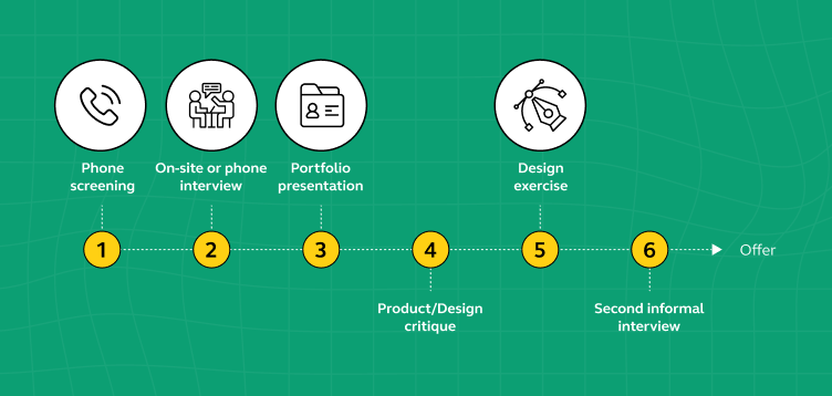
Now that we’ve gone through the important questions you might be asked in a UI/UX designer interview, let’s talk about how to do well in the interview. The following are some easy tips to help you do your best and show the people interviewing you that you’re the right person for the job.
Tips on Acing Your UI/UX Interview
Preparing for a UI/UX design interview requires more than just showcasing your portfolio. Here are some tips to help you excel in your UI/UX interview:
- Ensure you have a solid understanding of UI (User Interface) and UX (User Experience) design principles. Be able to define these terms clearly and explain how they relate to each other.
- Be ready to showcase your portfolio. Highlight a variety of projects that demonstrate your skills, including wireframes, prototypes, and finished designs. Explain your design process and the impact of your work on user experiences.
- Keep up with industry trends, new design tools, and emerging technologies. Interviewers may ask about your awareness of the latest developments in UI/UX design.
- Expect scenario-based questions that assess your problem-solving skills. Practice by tackling real-life UX challenges, explaining your thought process, and presenting solutions.
- Be prepared to critique a design or provide feedback on a given UI/UX scenario. Articulate your feedback constructively, focusing on usability, accessibility, and user-centered design.
- Familiarize yourself with usability testing methodologies and be ready to discuss how you’ve conducted user testing in your previous projects.
- Mention the design and prototyping tools you’re proficient in, such as Figma, Sketch, Adobe XD, or others. Highlight any certifications or courses you’ve completed.
- Emphasize your ability to work in cross-functional teams. UI/UX designers often collaborate with developers, product managers, and stakeholders. Discuss your teamwork and communication skills.
- Expect questions that assess your problem-solving abilities. Describe how you’ve addressed design challenges, resolved conflicts, or adapted to changing project requirements.
- Stress the importance of a user-centered design approach. Explain how you prioritize user needs, conduct user research, and iterate designs based on feedback.
- Prepare thoughtful questions to ask the interviewer. Inquire about the company’s design process, team dynamics, and the role of UI/UX in their projects.
- Don’t overlook the significance of soft skills. Highlight your attention to detail, creativity, empathy, and adaptability, which are essential qualities for UI/UX designers.
- Be ready to discuss specific case studies from your portfolio in depth. Walk the interviewer through your design decisions, challenges faced, and the impact of your work.
- Showcase your empathy for users. Explain how you’ve advocated for user needs and ensured that design decisions align with user goals and preferences.
- Demonstrate your alignment with the company’s culture and values. Explain how your personality and work ethic align with the team’s dynamics.
Remember that UI/UX design interviews often involve practical assessments, so be prepared to demonstrate your skills through design exercises or critiques. With thorough preparation and a user-centered mindset, you can increase your chances of acing your UI/UX interview and landing your dream job in the field.
Also Read: What Does a UI/UX Designer Do? [2024 Career Guide]
Conclusion
Doing well in a UI/UX design interview means having a good grasp of design principles, showcasing your work, and being able to solve problems. Make sure to understand what UI and UX mean, present your projects, and explain your design process. Stay updated with the latest design trends and tools, and practice answering design questions.
Also, highlight your teamwork and communication skills. When discussing your work, focus on how it helps users. Finally, ask the interviewer questions to show your interest. By following these tips and being prepared, you can do great in your UI/UX design interview and have a successful career in this field. Good luck!
Make sure you are also updated with 12 Key Elements For A Professional UI/UX Designer Resume Guide
FAQs
UI (User Interface) design focuses on the visual aspects of a product, including layout, colors, and typography. It deals with how the interface looks and how users interact with it. UX (User Experience) design, on the other hand, is about the overall experience of using a product.
It includes user research, usability, and ensuring that the product meets users’ needs and goals. While UI is about the interface’s appearance, UX is about the entire user journey.
UI/UX designers use various tools for different stages of the design process. Commonly used tools include Figma, Sketch, Adobe XD, InVision, and Axure RP for creating designs and prototypes.
They also use tools like UsabilityHub and Optimal Workshop for usability testing and research. The choice of tool depends on the project’s requirements and the designer’s preferences.
A UI/UX designer should have a combination of technical and soft skills. Technical skills include proficiency in design and prototyping tools, user research, wireframing, and usability testing.
Soft skills such as communication, empathy, problem-solving, and attention to detail are equally important. Designers should also stay updated with industry trends and be able to collaborate effectively with cross-functional teams.




![Top 25 Business Analyst Interview Questions and Answers [2025] 8 business analyst interview questions](https://www.guvi.in/blog/wp-content/uploads/2023/07/Business-Analyst-Interview-Questions-With-Answers.png)
![Top 20+ React Interview Questions and Answers [2025] 9 Top 20 React Interview Questions and Answers](https://www.guvi.in/blog/wp-content/uploads/2022/01/Top-20-React-Interview-Questions-and-Answers.png)



![Top 20 RPA UiPath Interview Questions and Answers [2025] 14 rpa uipath interview questions](https://www.guvi.in/blog/wp-content/uploads/2023/02/Top-20-RPA-UiPath-Interview-Questions-and-Answers.png)


Superb.Nice way of giving tips to an interviewee.
Very very helpfull article which I have experienced in my Interview.